LACEWORK / TRELLIS DESIGN SYSTEM
Leading accessibility improvements and library management initiatives
Leading accessibility improvements and library management initiatives
Leading accessibility improvements and library management initiatives
As the UX Lead for Lacework's Trellis Design System, I led initiatives for managing the component library and improving in-product accessibility during product redesign.
MY ROLE
Lead Product Designer
TEAM
2 Frontend Developers • 1 Designer • User Researcher
USERS / PERSONAS
Product Designers, Software Engineers, Lacework Customers
ACTIVITIES PERFORMED
Design Systems Management • Visual Design • Interaction Design • Heuristic Evaluation • Documentation • Design Strategy • Roadmap Planning • Metrics • Business Process Design • Presentations • Collaboration • Stakeholder Buy-in • Measure Impact
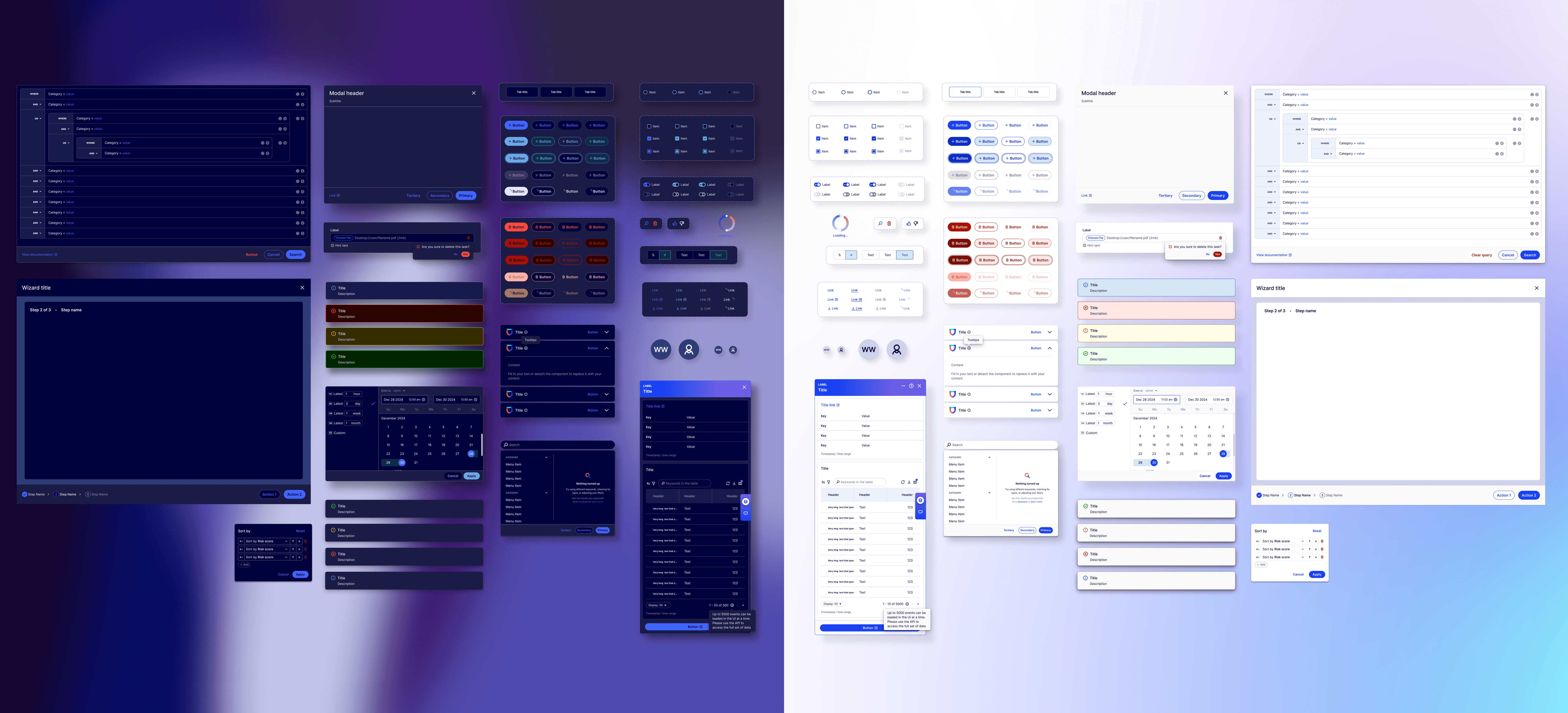
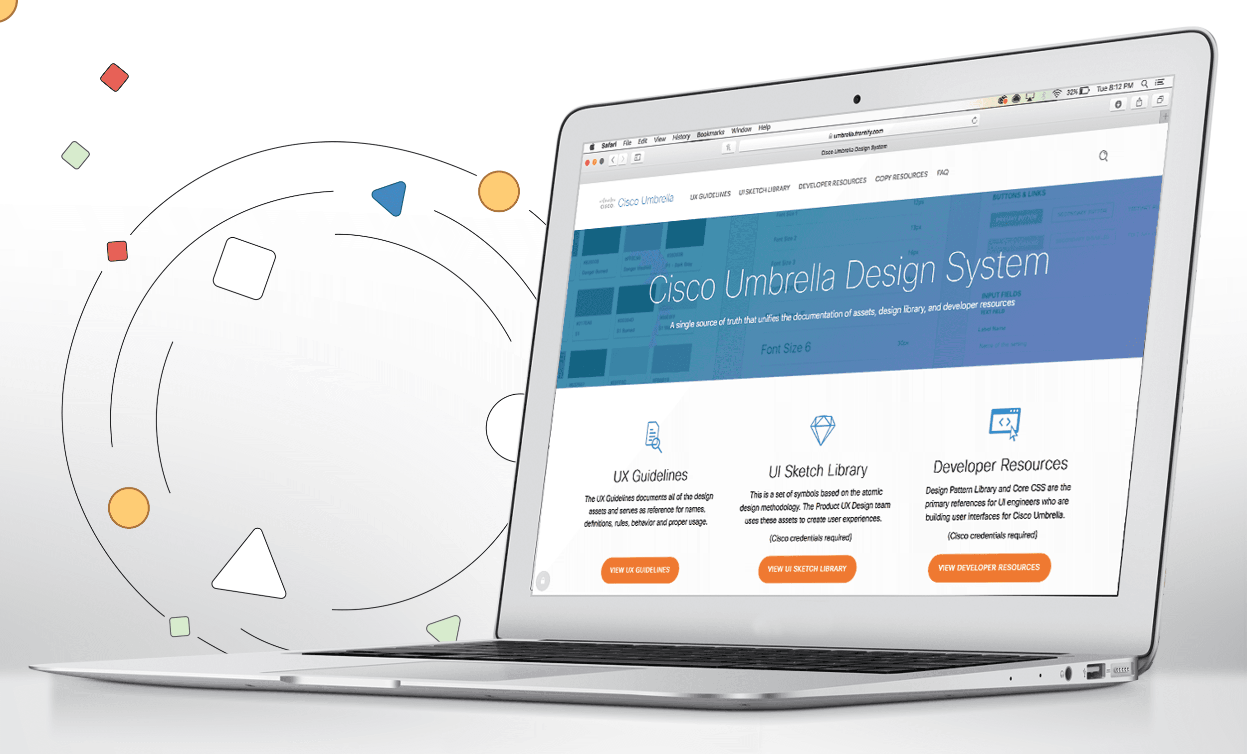
Trellis Design System, the single source of truth for designing and building Lacework UI
Trellis Design System, the single source of truth for designing and building Lacework UI
Trellis Design System, the single source of truth for designing and building Lacework UI
Trellis documents the usage guidelines for a collection of foundational elements, components and patterns. It empowers feature teams to create consistent, accessible, scalable user experiences for Lacework customers.
The Platform UX team and Core UI Eng served as the creators and guardians of the design system with a mission to drive conceptual consistency powered by user insights. We connected the dots to build a coherent and unified enterprise product experience.
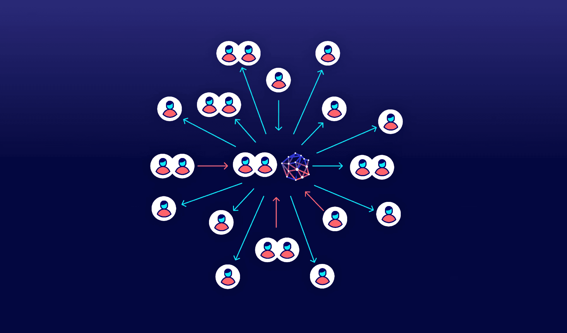
OKR: Eliminate usability as an objection to Lacework.
OKR: Eliminate usability as an objection to Lacework.
OKR: Eliminate usability as an objection to Lacework.
Customers stated a number of usability issues as the reason for not acquiring Lacework as their cybersecurity solution. The most common usability issues were grouped into themes and correlated with the volume of business that may be lost if unresolved.
It was decided to conduct a heuristic evaluation to get more specific detail on areas impacted by usability and use it as a basis for improving UI.
Projected loss of accounts and opportunities as a result of not addressing usability issues.
Projected loss of accounts and opportunities as a result of not addressing usability issues.
12
12
12
Admin
Issues with settings and notifications.
Admin: Issues with settings / notification
21
21
21
Not enough data
Insufficient info hinders task completion or making informed decisions.
Not enough data: Insufficient info hinders task completion or making informed decisions.
23
23
23
Uncustomizable
It is not possible for customers to tailor the user interface to suit their specific needs.
Uncustomizable: It is not possible for customers to tailor the user interface to suit their specific needs.
23
23
23
Weak correlation
Lost connections between elements cause confusion and ineffective navigation.
Weak correlation: Lost connections between elements cause confusion and ineffective navigation.
52
52
Deficient toolset
Lack or insufficiency of resources available to users which manifest as limited functionality, limited scope or poor design.
Deficient toolset: Lack or insufficiency of resources available to users which manifest as limited functionality, limited scope or poor design.
Heuristic evaluation
I partnered with a user researcher to develop a heuristic evaluation framework and process based on Jakob Neilen's 10 heuristics for interaction design. Later, we including an additional 4 principles — keyboard navigability, animation, localization and responsiveness. Each principle included a list of related statements that evaluators responded to with "yes," "no" or "not applicable."
Goals
Discover usability problems and build a set of initial impressions for user testing.
Prioritize issues and improve the overall usability of the product.
Provide the team with the next set of OKRs defined with these scores.
Reduce the amount of reported post-release bugs and avert critical incidents.
Presentation materials created to introduce the Heuristic Evaluation Process Framework at a product offsite.

<100% opacity affecting accessibility and cohesion
Without full opacity colors easily fall out of
compliance on depending on the background.
Redundant colors
bloating the codebase
Engineers expend effort to identify the appropriate light/dark color pairs to use and sometimes create new colors to fill the gaps, contributing to inconsistencies and codebase bloat. This causes large files and slow load times for customers.
Color library with many redundant and obsolete colors.
Disorganized, cluttered references
Pages were littered with in-progress work,
old or obsolete versions, conceptual
components without vetted use cases
Insufficient documentation
Issues with docs included missing usage guidelines
and labels, lacking focus states and buried assets

Scorecard
Results gathered from the evaluation demonstrated gaps in several areas and presented opportunities for improvement of overall usability.
0%
Localization
28%
Help and documentation
39%
Responsiveness
42%
Recognition rather than recall
45%
Help users recognize, diagnose and recover from errors
50%
Error prevention
56%
Animation
58%
Visibility of system status
71%
Match between system and the real world
72%
Aesthetic and minimal design
73%
User control and freedom
77%
Flexibility and efficiency of use
88%
Consistency and standards
55%
Average Overall Heuristic Evaluation Score
On a scale of 0-100%
Heuristic evaluation
I partnered with a user researcher to develop a heuristic evaluation framework and process based on Jakob Neilen's 10 heuristics for interaction design. Later, we including an additional 4 principles — keyboard navigability, animation, localization and responsiveness. Each principle included a list of related statements that evaluators responded to with "yes," "no" or "not applicable."
Goals
Discover usability problems and build a set of initial impressions for user testing.
Prioritize issues and improve the overall usability of the product.
Provide the team with the next set of OKRs defined with these scores.
Reduce the amount of reported post-release bugs and avert critical incidents.
Presentation materials created to introduce the Heuristic Evaluation Process Framework at a product offsite.
Scorecard
Results gathered from the evaluation demonstrated gaps in several areas and presented opportunities for improvement of overall usability.
0%
Localization
28%
Help and documentation
39%
Responsiveness
42%
Recognition rather than recall
45%
Help users recognize, diagnose and recover from errors
50%
Error prevention
56%
Animation
58%
Visibility of system status
71%
Match between system and the real world
72%
Aesthetic and minimal design
73%
User control and freedom
77%
Flexibility and efficiency of use
88%
Consistency and standards
55%
Average Overall Heuristic Evaluation Score
On a scale of 0-100%
Redundant colors bloating the codebase
Engineers expend effort to identify the appropriate light/dark color pairs to use and sometimes create new colors to fill the gaps, contributing to inconsistencies and codebase bloat. This causes large files and slow load times for customers.
Color library with many redundant and obsolete colors.
Disorganized, cluttered references
Pages were littered with in-progress work, old or obsolete versions,
conceptual components without vetted use cases<100% opacity affecting accessibility and cohesion
Without full opacity colors easily fall out of
compliance on depending on the background.Insufficient documentation
Issues with docs included missing usage guidelines and
labels, lacking focus states and buried assets
Unlabled component sets
Teams have to click on individual components to understand variant state, size, etc.
Missing states
Missing documentation for focus and destructive states
Buried components
Icon Button, Link and Button Group documentation is often overlooked because they are contained under "Button."
Heuristic evaluation
I partnered with a user researcher to develop a heuristic evaluation framework and process based on Jakob Neilen's 10 heuristics for interaction design. Later, we including an additional 4 principles — keyboard navigability, animation, localization and responsiveness. Each principle included a list of related statements that evaluators responded to with "yes," "no" or "not applicable."
Goals
Discover usability problems and build a set of initial impressions for user testing.
Prioritize issues and improve the overall usability of the product.
Provide the team with the next set of OKRs defined with these scores.
Reduce the amount of reported post-release bugs and avert critical incidents.
Presentation materials created to introduce the Heuristic Evaluation Process Framework at a product offsite.
Scorecard
Results gathered from the evaluation demonstrated gaps in several areas and presented opportunities for improvement of overall usability.
0%
Localization
28%
Help and documentation
39%
Responsiveness
42%
Recognition rather than recall
45%
Help users recognize, diagnose and recover from errors
50%
Error prevention
56%
Animation
58%
Visibility of system status
71%
Match between system and the real world
72%
Aesthetic and minimal design
73%
User control and freedom
77%
Flexibility and efficiency of use
88%
Consistency and standards
55%
Average Overall Heuristic Evaluation Score
On a scale of 0-100%
Redundant colors bloating the codebase
Engineers expend effort to identify the appropriate light/dark color pairs to use and sometimes create new colors to fill the gaps, contributing to inconsistencies and codebase bloat. This causes large files and slow load times for customers.
Color library with many redundant and obsolete colors.
Disorganized, cluttered references
Pages were littered with in-progress work, old or obsolete versions,
conceptual components without vetted use cases<100% opacity affecting accessibility and cohesion
Without full opacity colors easily fall out of
compliance on depending on the background.Insufficient documentation
Issues with docs included missing usage guidelines and
labels, lacking focus states and buried assetsUnlabled component sets
Teams have to click on individual components to understand variant state, size, etc.
Missing states
Missing documentation for focus and destructive states
Buried components
Icon Button, Link and Button Group documentation is often overlooked because they are contained under "Button."
Heuristic evaluation
I partnered with a user researcher to develop a heuristic evaluation framework and process based on Jakob Neilen's 10 heuristics for interaction design. Later, we including an additional 4 principles — keyboard navigability, animation, localization and responsiveness. Each principle included a list of related statements that evaluators responded to with "yes," "no" or "not applicable."
Goals
Discover usability problems and build a set of initial impressions for user testing.
Prioritize issues and improve the overall usability of the product.
Provide the team with the next set of OKRs defined with these scores.
Reduce the amount of reported post-release bugs and avert critical incidents.
Presentation materials created to introduce the Heuristic Evaluation Process Framework at a product offsite.
Scorecard
Results gathered from the evaluation demonstrated gaps in several areas and presented opportunities for improvement of overall usability.
0%
Localization
28%
Help and documentation
39%
Responsiveness
42%
Recognition rather than recall
45%
Help users recognize, diagnose and recover from errors
50%
Error prevention
56%
Animation
58%
Visibility of system status
71%
Match between system and the real world
72%
Aesthetic and minimal design
73%
User control and freedom
77%
Flexibility and efficiency of use
88%
Consistency and standards
55%
Average Overall Heuristic Evaluation Score
On a scale of 0-100%
<100% opacity affecting accessibility and cohesion
Without full opacity colors easily fall out of compliance on depending on the background.
Redundant colors bloating the codebase
Engineers expend effort to identify the appropriate light/dark color pairs to use and sometimes create new colors to fill the gaps, contributing to inconsistencies and codebase bloat. This causes large files and slow load times for customers.
Color library with many redundant and obsolete colors.
Disorganized, cluttered references
Pages were littered with in-progress work, old or obsolete versions, conceptual components without vetted use cases
Insufficient documentation
Issues with docs included missing usage guidelines and labels, lacking focus states and buried assets
Unlabled component sets
Teams have to click on individual components to understand variant state, size, etc.
Missing states
Missing documentation for focus and destructive states
Buried components
Icon Button, Link and Button Group documentation is often overlooked because they are contained under "Button."
Heuristic evaluation
I partnered with a user researcher to develop a heuristic evaluation framework and process based on Jakob Neilen's 10 heuristics for interaction design. Later, we including an additional 4 principles — keyboard navigability, animation, localization and responsiveness. Each principle included a list of related statements that evaluators responded to with "yes," "no" or "not applicable."
Goals
Discover usability problems and build a set of initial impressions for user testing.
Prioritize issues and improve the overall usability of the product.
Provide the team with the next set of OKRs defined with these scores.
Reduce the amount of reported post-release bugs and avert critical incidents.
Presentation materials created to introduce the Heuristic Evaluation Process Framework at a product offsite.
Scorecard
Results gathered from the evaluation demonstrated gaps in several areas and presented opportunities for improvement of overall usability.
0%
Localization
28%
Help and documentation
39%
Responsiveness
42%
Recognition rather than recall
45%
Help users recognize, diagnose and recover from errors
50%
Error prevention
56%
Animation
58%
Visibility of system status
71%
Match between system and the real world
72%
Aesthetic and minimal design
73%
User control and freedom
77%
Flexibility and efficiency of use
88%
Consistency and standards
55%
Average Overall Heuristic Evaluation Score
On a scale of 0-100%
<100% opacity affecting accessibility and cohesion
Without full opacity colors easily fall out of compliance on depending on the background.
Redundant colors bloating the codebase
Engineers expend effort to identify the appropriate light/dark color pairs to use and sometimes create new colors to fill the gaps, contributing to inconsistencies and codebase bloat. This causes large files and slow load times for customers.
Color library with many redundant and obsolete colors.
Disorganized, cluttered references
Pages were littered with in-progress work, old or obsolete versions, conceptual components without vetted use cases
Insufficient documentation
Issues with docs included missing usage guidelines and labels, lacking focus states and buried assets
Unlabled component sets
Teams have to click on individual components to understand variant state, size, etc.
Missing states
Missing documentation for focus and destructive states
Buried components
Icon Button, Link and Button Group documentation is often overlooked because they are contained under "Button."
How can we ensure a reliable source of truth while supporting feature teams in our shared mission to improve the user experience?
How can we ensure a
reliable source of truth while supporting feature teams
in our shared mission to improve the user experience?
How can we ensure a reliable source of truth while supporting feature teams in our shared mission to improve the user experience?

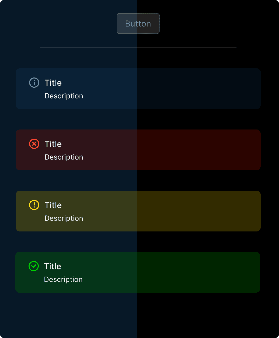
Poor Accessibility
and Messy Libraries
Poor Accessibility
and Messy Libraries
Poor Accessibility
and Messy Libraries
A11Y Problems
Missing focus states
<100% opacity used for fills, states
Weak Library Organization
Poor library organization
Missing guidelines and unlabeled sheets
Outdated, superfluous references
Missing dark/light mode pairs
Custom values used instead of styles
Broken builds and inefficient components
Impact on Customers
and Teams
Impact on Customers
and Teams
Impact on Customers
and Teams

Trellis Design System Library Management Initiative
A library management initiative that seeks to enforce better
design system hygiene while improving accessibility
Set Accessibility
StandardsAssure that the design system enables teams to build Lacework user experience that are inclusive, usable and removes barriers for interaction.
Assign light/dark theme pairs
Min. 50% keyboard navigable UI
Increase compliance WCAG Level AA
Reliable and
Complete ReferencesTrellis must include necessary foundational elements and components to support the design efforts of the team, reduce manual labor and minimize errors.
Change styles to token variables
100% components use tokens
100% current components in library
Guidelines/specs are complete
Trellis Redesign: Enhancing UX through "Project Broadway" collaboration with marketing creative
During this time, a redesign was underway that imbued the UI with refreshed styles and new interactions. The Trellis Redesign is derived from concepts created by the Lacework UX team through "Project Broadway" which envisions new interactive workflows and new styles developed in a collaboration with Marketing Creative.
We used this as an opportunity to address accessibility, issues with color theming and functional updates.
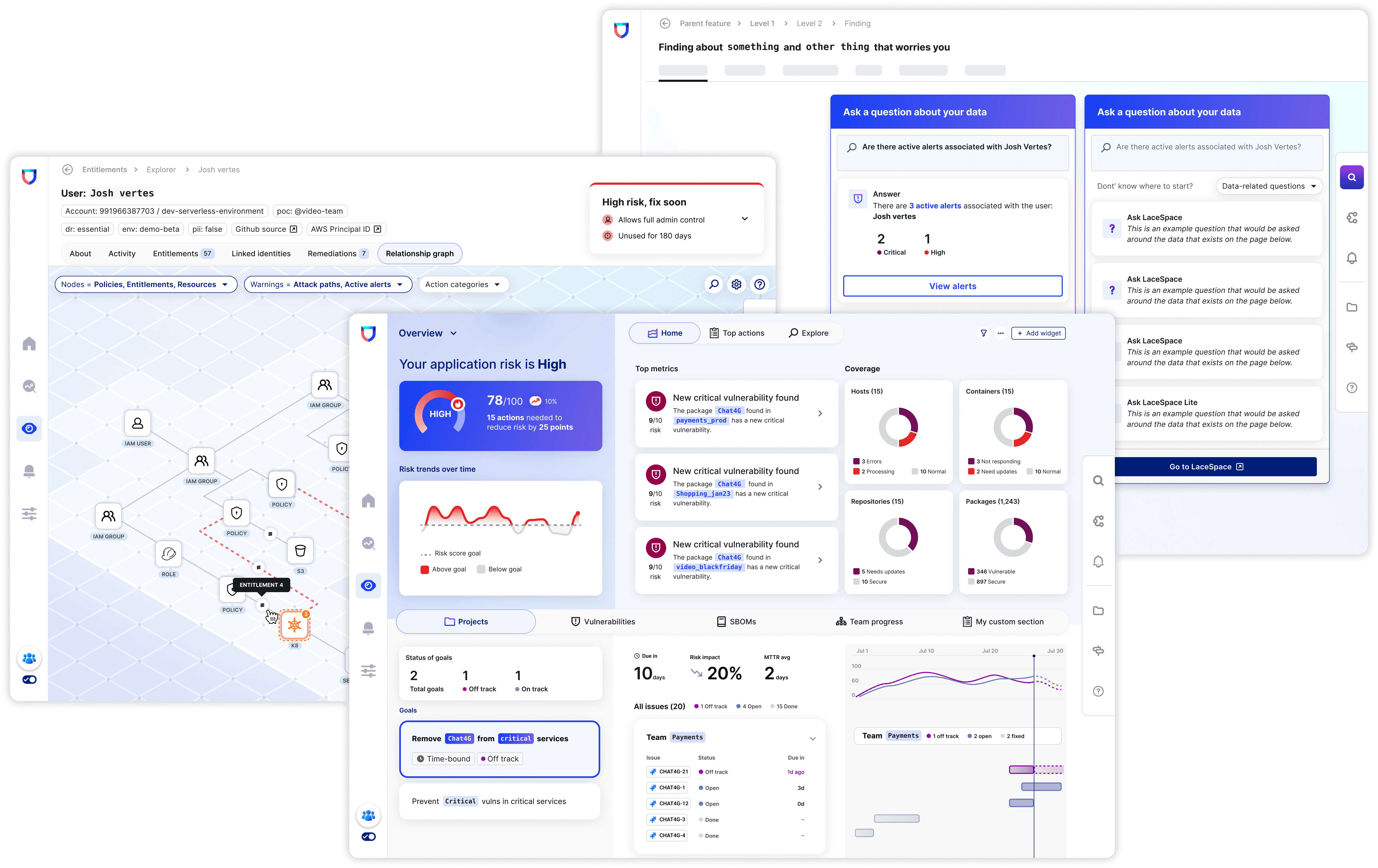
Conceptual layouts from Project Broadway
Trellis 2.0 Foundations Testing Ground
I partnered with the feature designer who was assigned to CISO Dashboard. Together we identified accessible colors in light and dark for the dashboard. We then identified the most common layouts and began color tests with them.
Accessing accessibility for proposed dark theme colors.

Collaborative process in translating styles to tokens
I consolidated the palettes, built out color documentation and translating them into reusable tokens (variables) for use in Figma. While this was in progress, the feature designer created a spreadsheet that mapped the existing color styles in Trellis 1.0 to the new Trellis 2.0 color tokens. Feature and Core UI Eng leads were informed throughout and consulted on approach for implementation.

This was used to help communicate changes with frontend engineering.
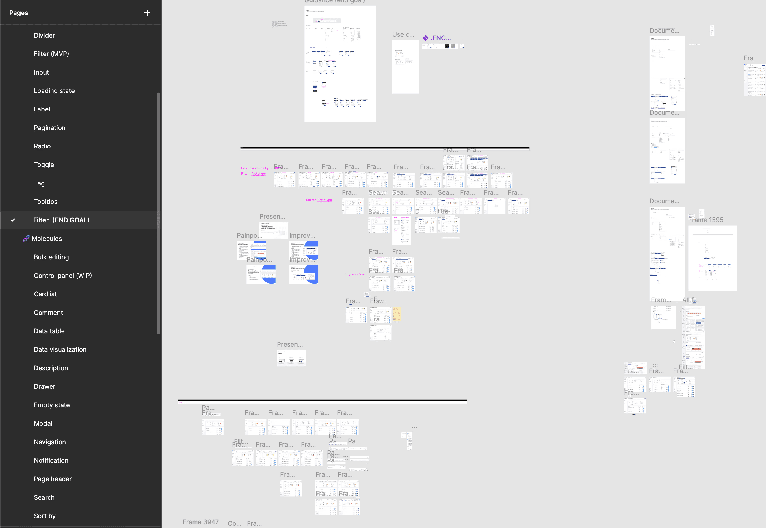
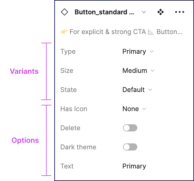
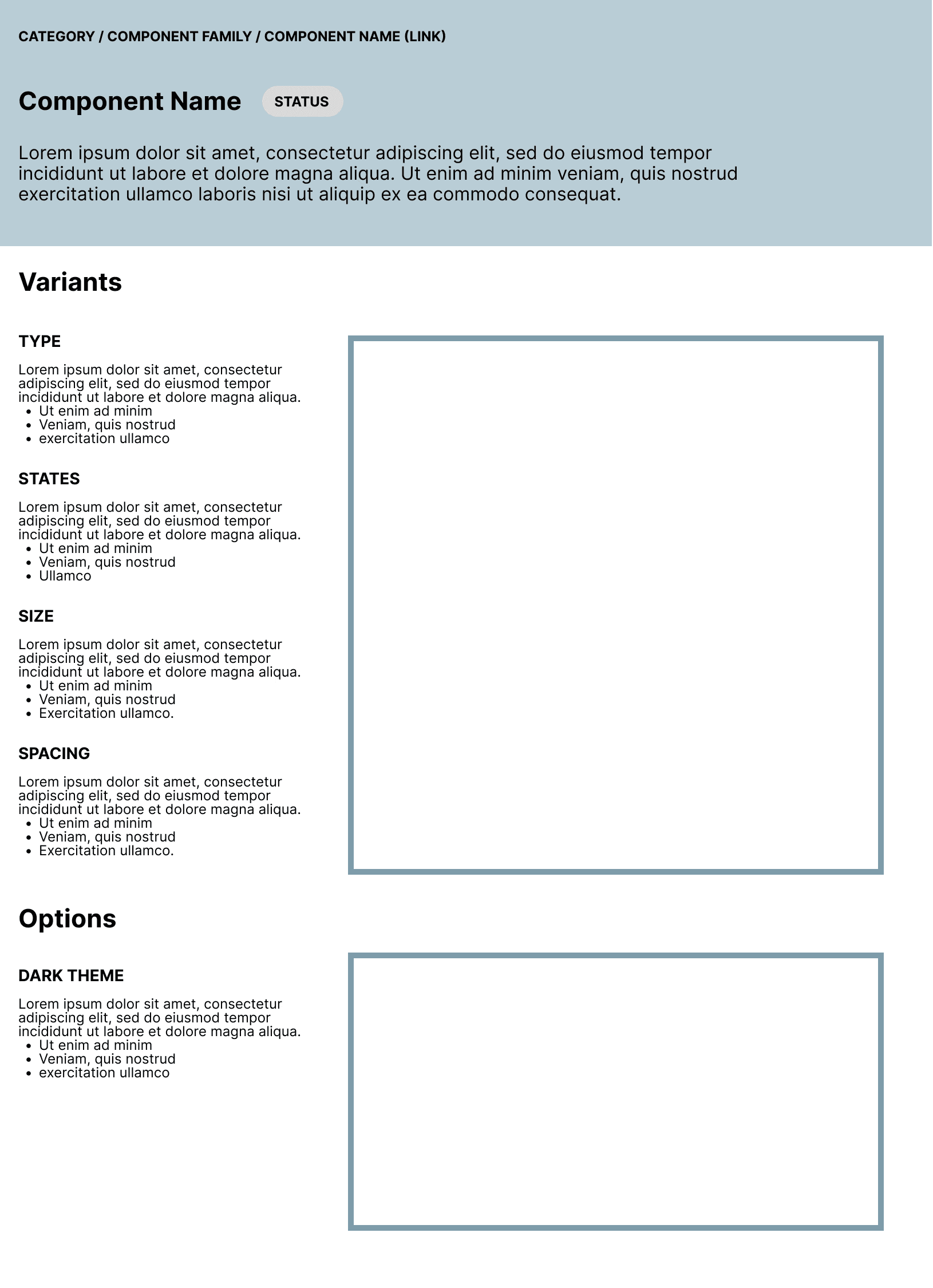
Wireframes: Addressing component library structure and guidelines
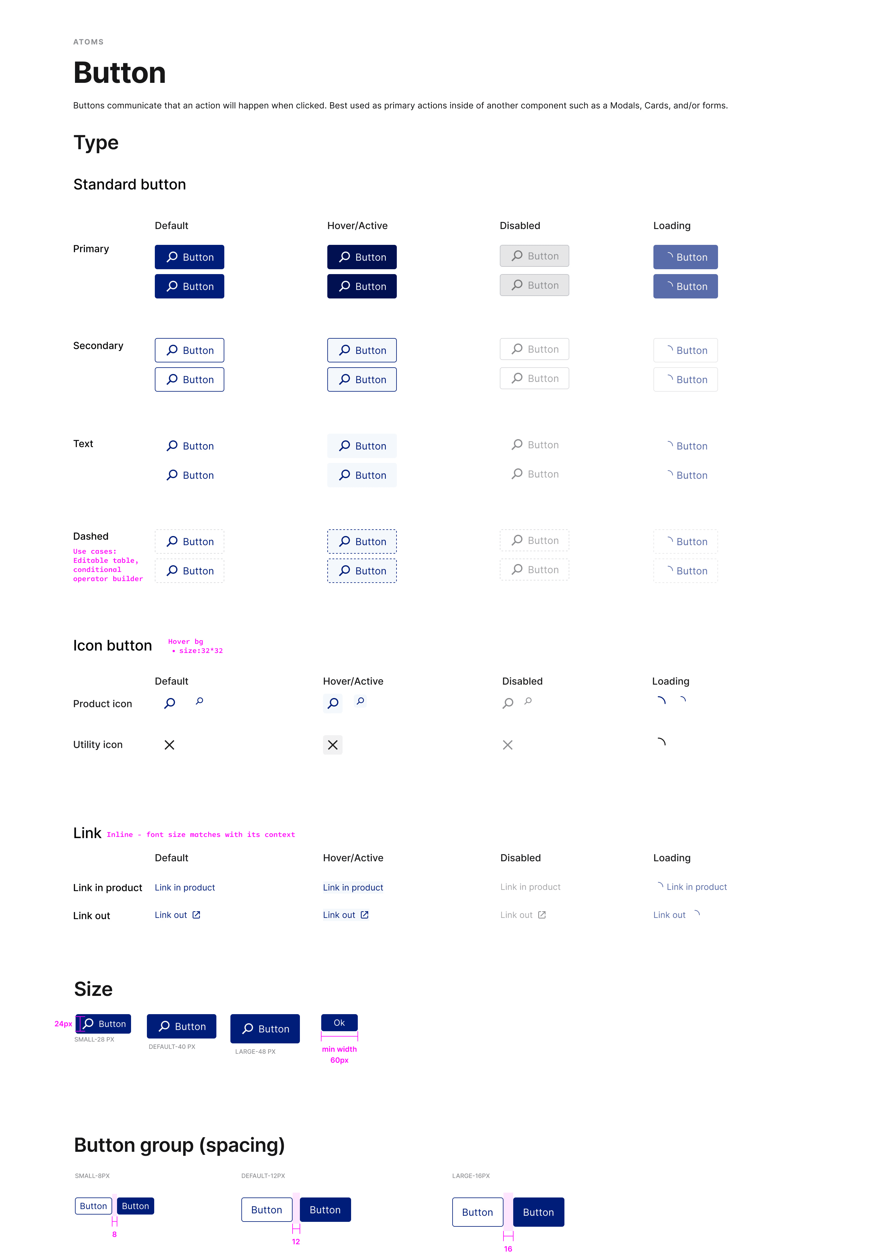
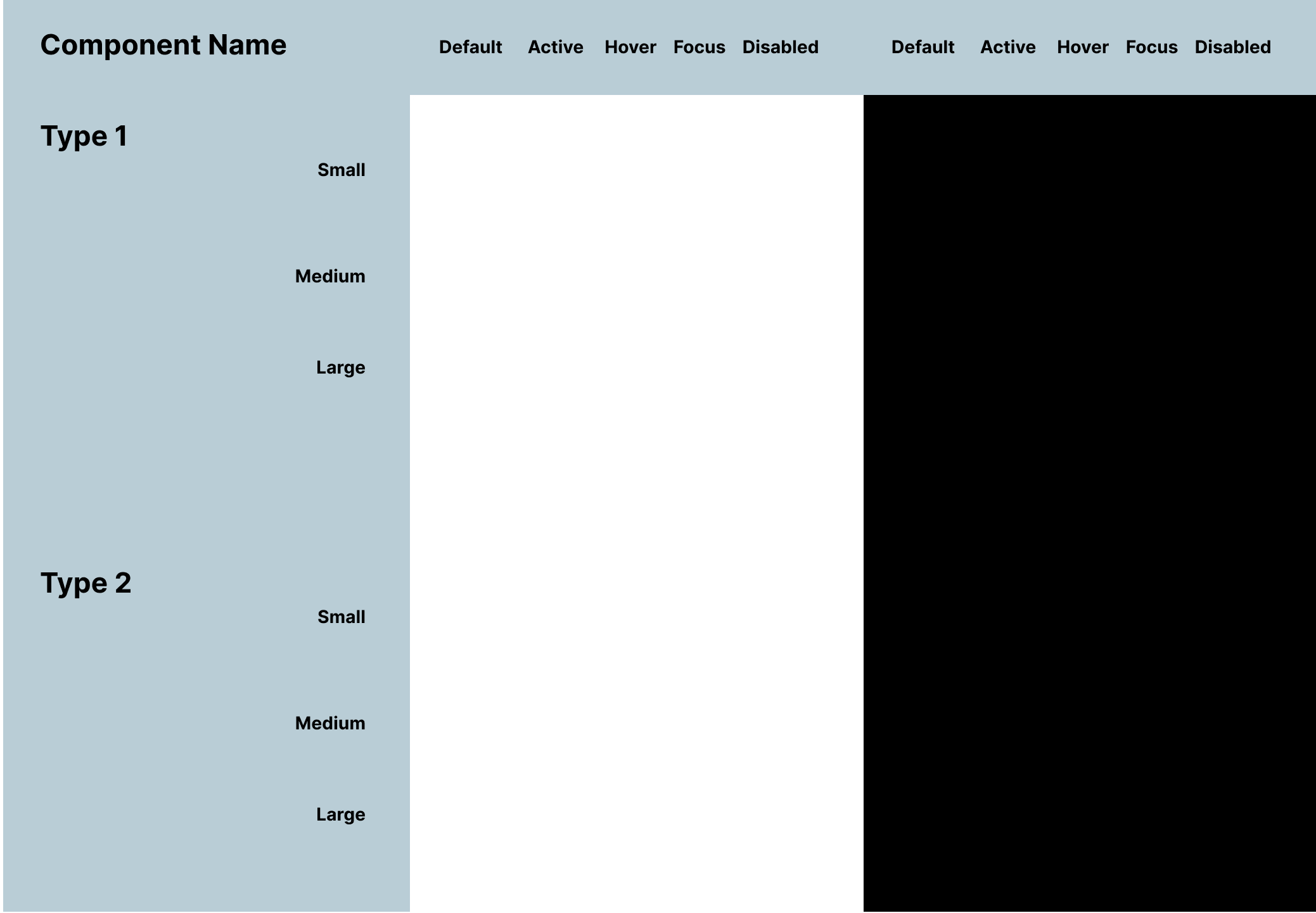
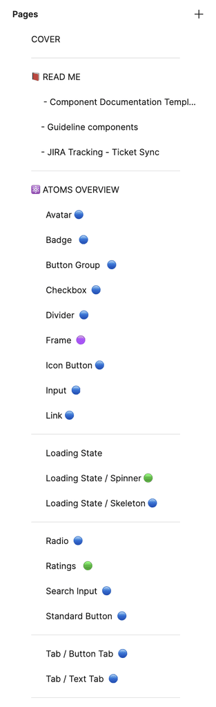
In Trellis 2.0, I reorganized the library according to increased complexity and included statuses per each component. I then planned out the component documentation using the Figma component menu as a map for dividing guidelines into Variants and Options. Components are labeled vertically by name, type, and size, and horizontally by state.
All conceptual work were relocated to separate files.
Obsolete components were marked for deprecation and set for removal based on a plan for component deprecation.
Trellis Design System Library Management Initiative
A library management initiative that seeks to enforce better
design system hygiene while improving accessibility
Set Accessibility
StandardsAssure that the design system enables teams to build Lacework user experience that are inclusive, usable and removes barriers for interaction.
Assign light/dark theme pairs
Min. 50% keyboard navigable UI
Increase compliance WCAG Level AA
Reliable and
Complete ReferencesTrellis must include necessary foundational elements and components to support the design efforts of the team, reduce manual labor and minimize errors.
Change styles to token variables
100% components use tokens
100% current components in library
Guidelines/specs are complete
Trellis Redesign: Enhancing UX through "Project Broadway" collaboration with marketing creative
During this time, a redesign was underway that imbued the UI with refreshed styles and new interactions. The Trellis Redesign is derived from concepts created by the Lacework UX team through "Project Broadway" which envisions new interactive workflows and new styles developed in a collaboration with Marketing Creative.
We used this as an opportunity to address accessibility, issues with color theming and functional updates.
Conceptual layouts from Project Broadway
Trellis 2.0 Foundations Testing Ground
I partnered with the feature designer who was assigned to CISO Dashboard. Together we identified accessible colors in light and dark for the dashboard. We then identified the most common layouts and began color tests with them.
Accessing accessibility for proposed dark theme colors.
Collaborative process in translating styles to tokens
I consolidated the palettes, built out color documentation and translating them into reusable tokens (variables) for use in Figma. While this was in progress, the feature designer created a spreadsheet that mapped the existing color styles in Trellis 1.0 to the new Trellis 2.0 color tokens. Feature and Core UI Eng leads were informed throughout and consulted on approach for implementation.
This was used to help communicate changes with frontend engineering.
Wireframes: Addressing component library structure and guidelines
In Trellis 2.0, I reorganized the library according to increased complexity and included statuses per each component. I then planned out the component documentation using the Figma component menu as a map for dividing guidelines into Variants and Options. Components are labeled vertically by name, type, and size, and horizontally by state.
All conceptual work were relocated to separate files.
Obsolete components were marked for deprecation and set for removal based on a plan for component deprecation.
Trellis Design System Library Management Initiative
A library management initiative that
seeks to enforce better design system
hygiene while improving accessibility
Set Accessibility
Standards
Assure that the design system enables teams to build Lacework user experience that are inclusive, usable and removes barriers for interaction.
Assign light/dark theme pairs
Min. 50% keyboard navigable UI
Increase compliance WCAG Level AA
Reliable and
Complete References
Trellis must include necessary foundational elements and components to support the design efforts of the team, reduce manual labor and minimize errors.
Change styles to token variables
100% components use tokens
100% current components in library
Guidelines/specs are complete
Trellis Redesign: Enhancing UX through "Project Broadway" collaboration with marketing creative
During this time, a redesign was underway that imbued the UI with refreshed styles and new interactions. The Trellis Redesign is derived from concepts created by the Lacework UX team through "Project Broadway" which envisions new interactive workflows and new styles developed in a collaboration with Marketing Creative.
We used this as an opportunity to address accessibility, issues with color theming and functional updates.
Conceptual layouts from Project Broadway
Trellis 2.0 Foundations Testing Ground
I partnered with the feature designer who was assigned to CISO Dashboard. Together we identified accessible colors in light and dark for the dashboard. We then identified the most common layouts and began color tests with them.
Accessing accessibility for proposed dark theme colors.
Collaborative process in translating styles to tokens
I consolidated the palettes, built out color documentation and translating them into reusable tokens (variables) for use in Figma. While this was in progress, the feature designer created a spreadsheet that mapped the existing color styles in Trellis 1.0 to the new Trellis 2.0 color tokens. Feature and Core UI Eng leads were informed throughout and consulted on approach for implementation.
This was used to help communicate changes with frontend engineering.
Wireframes:
Addressing component library structure and guidelines
In Trellis 2.0, I reorganized the library according to increased complexity and included statuses per each component. I then planned out the component documentation using the Figma component menu as a map for dividing guidelines into Variants and Options. Components are labeled vertically by name, type, and size, and horizontally by state.
All conceptual work were relocated to separate files.
Obsolete components were marked for deprecation and set for removal based on a plan for component deprecation.

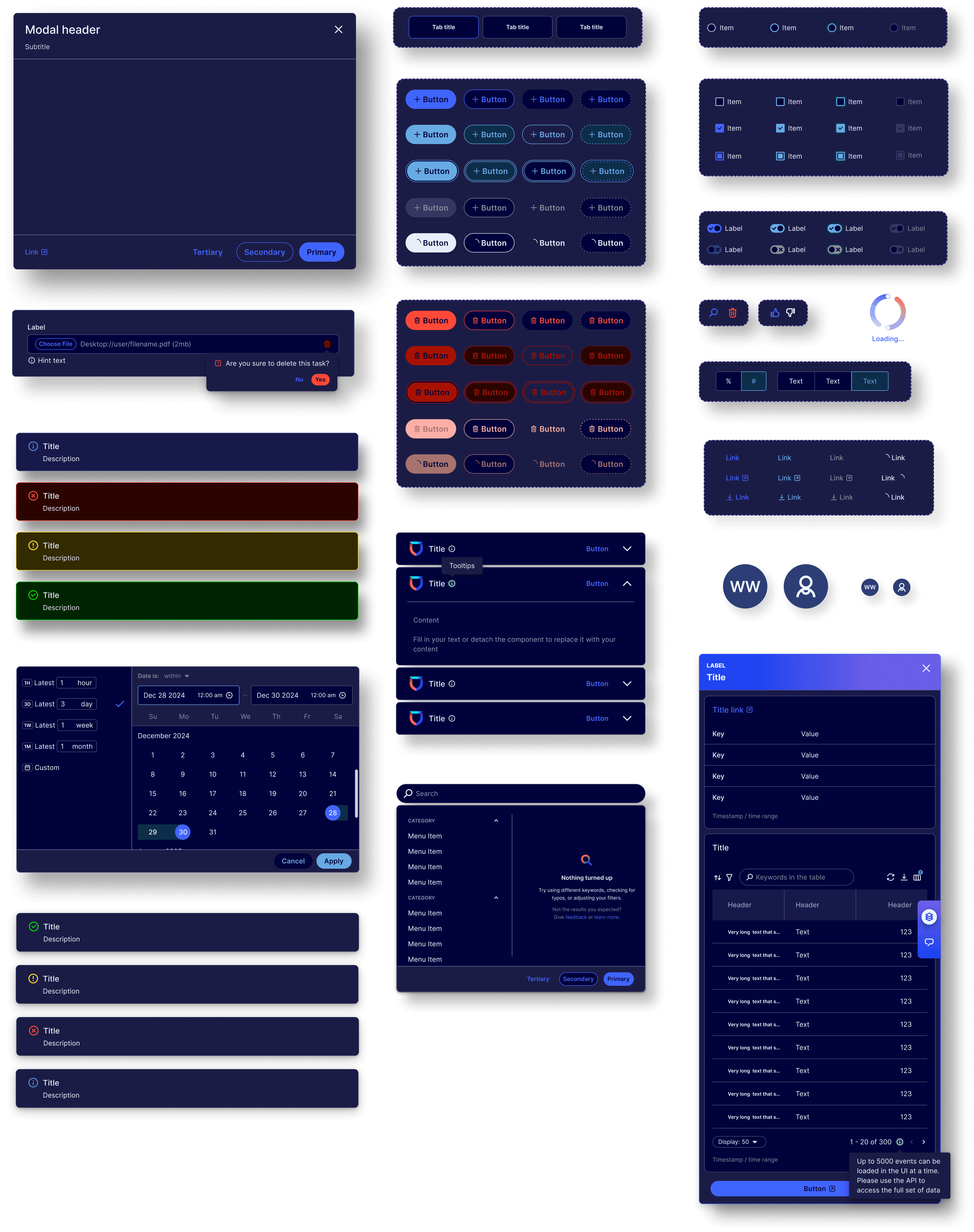
Trellis Design System 2.0
Trellis Design System 2.0
Trellis Design System 2.0

Focus States for enhanced accessibility
Focus States for
enhanced accessibility
Focus States for enhanced accessibility
Engineers used the new focus state specs to introduce Lacework's first keyboard navigable functionality.
Engineers used the new focus state specs to introduce Lacework's first keyboard navigable functionality.
Engineers used the new focus state specs to introduce Lacework's first keyboard navigable functionality.
A new foundation library
A new foundation library
A new foundation library
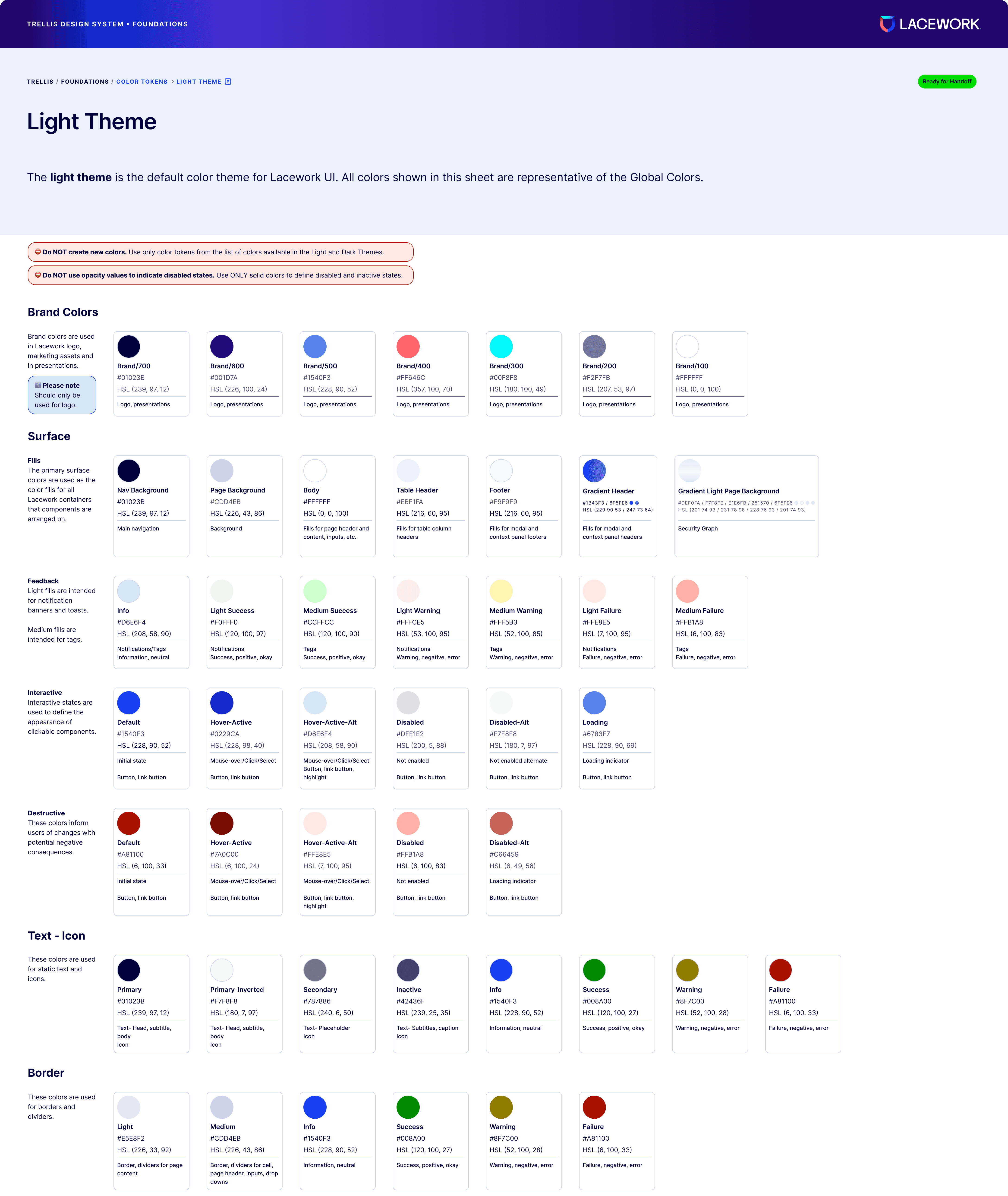
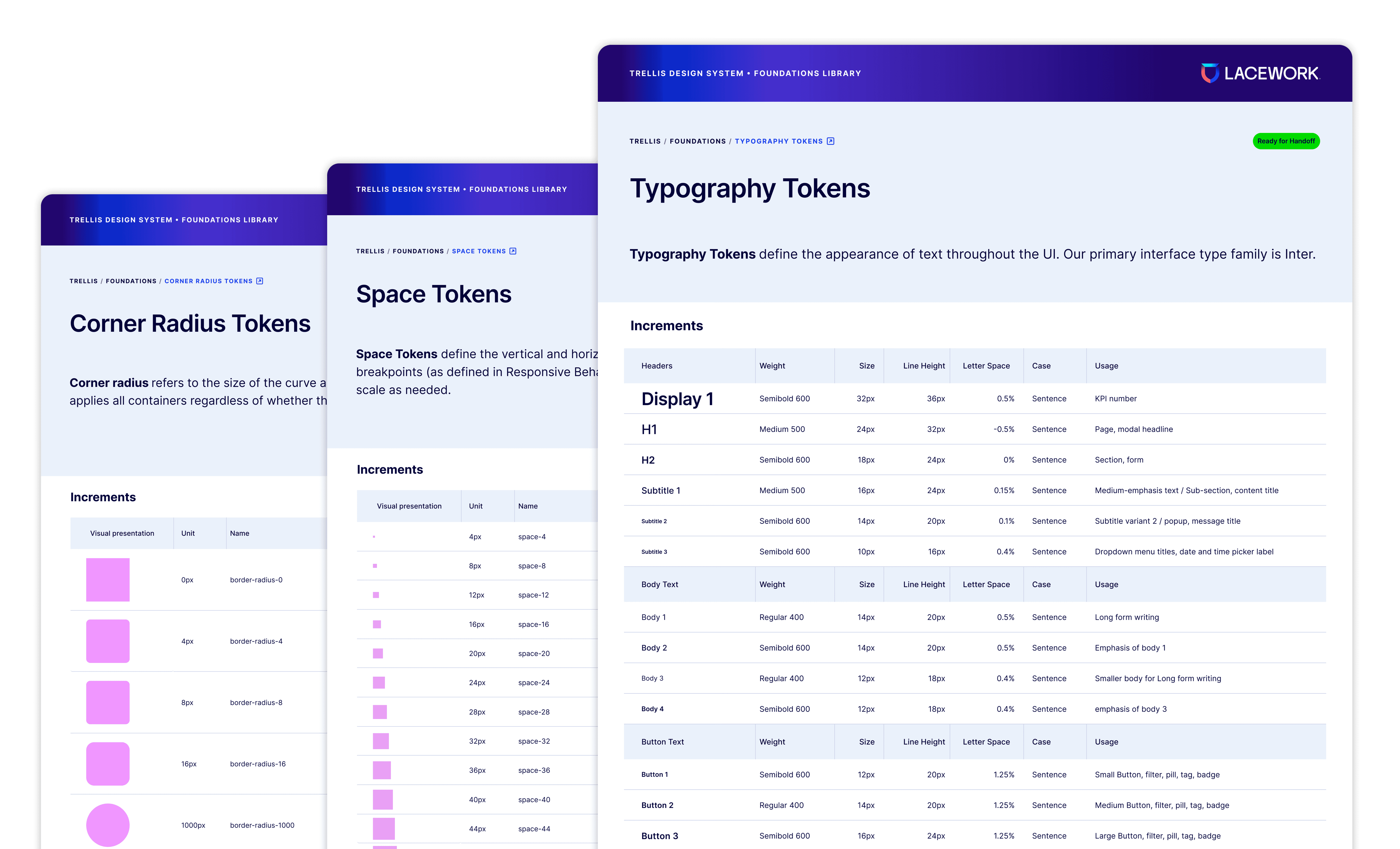
The new Trellis Design System Foundation Library shifted from style based values to tokens for Color, Typography, Corner Radius and Space. This creates more cohesion and control for future planning, localization and responsive use cases.
The new Trellis Design System Foundation Library
shifted from style based values to tokens for Color, Typography, Corner Radius and Space. This creates
more cohesion and control for future planning,
localization and responsive use cases.
The new Trellis Design System Foundation Library shifted from style based values to tokens for Color, Typography, Corner Radius and Space. This creates more cohesion and control for future planning, localization and responsive use cases.


Component documentation revisited
Component
documentation revisited
Component documentation revisited
Our new structure and templates provides Platform UX with the tools needed to build references that are organized and easy to follow.
Our new structure and templates provides
Platform UX with the tools needed to build
references that are organized and easy to follow.
Our new structure and templates provides Platform UX with the tools needed to build references that are organized and easy to follow.
The Read Me section is a reference for how the file is organized, best practices for composing guidelines and templates for documenting guidelines, specs and component sheets.
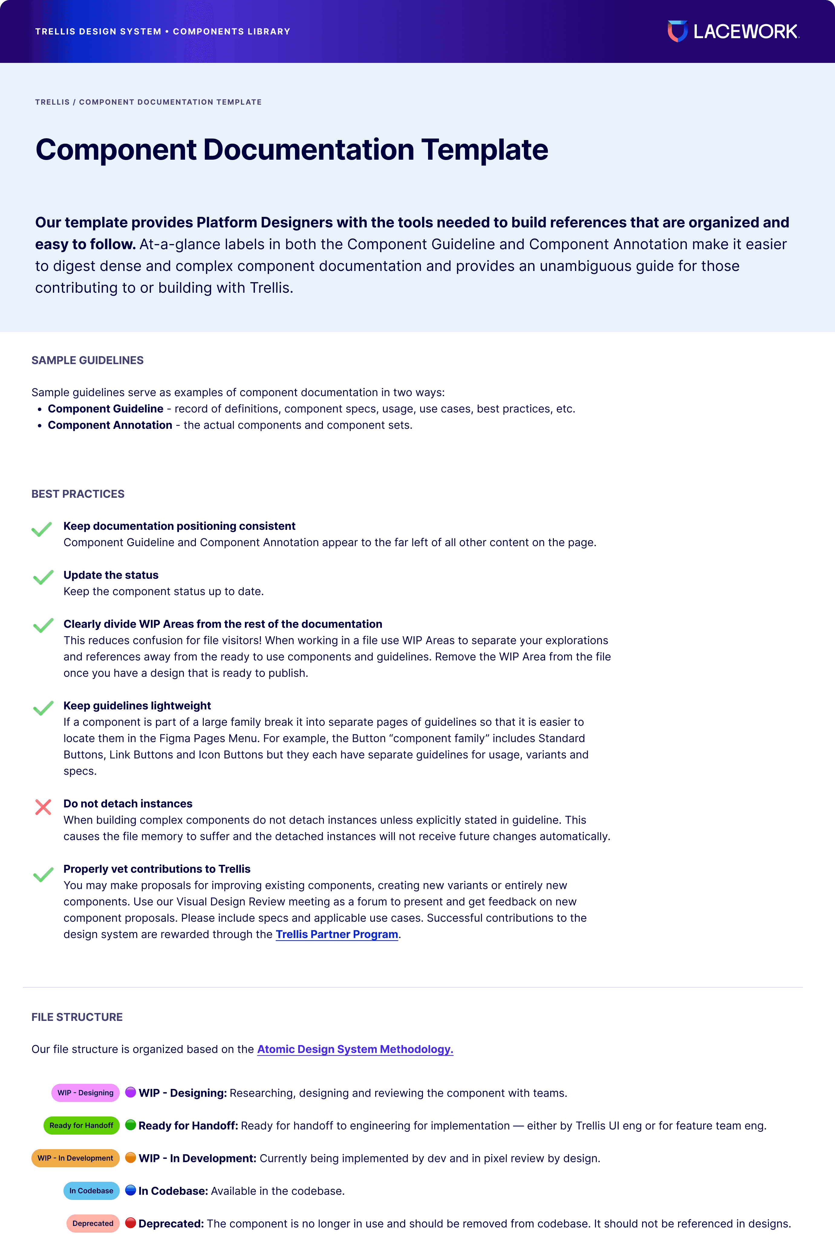
New documentation template
Designed to provide the UX team and XFNs easily digestible documentation for contributing to or building with Trellis.

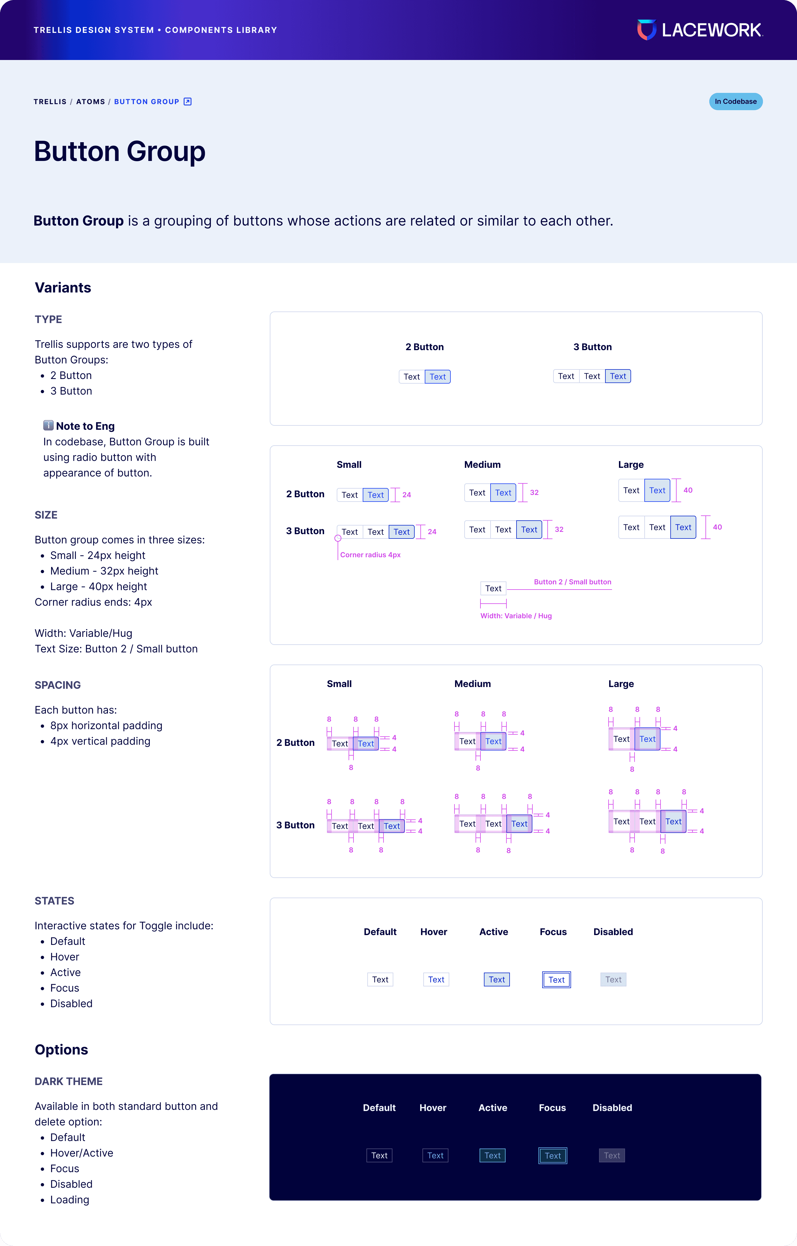
Overviews have component category definitions based on Atomic Methodology and a change log listing related components and their statuses.
New documentation template
Designed to provide the UX team and XFNs easily digestible documentation for contributing to or building with Trellis.
Link to Storybook
In an effort to build more connective tissue between our react library and our Figma files, each guideline should include a link to its counterpart in Storybook.
Link to Storybook
In an effort to build more connective tissue between our react library and our Figma files, each guideline should include a link to its counterpart in Storybook.
Link to Storybook
In an effort to build more connective tissue between our react library and our Figma files, each guideline should include a link to its counterpart in Storybook.
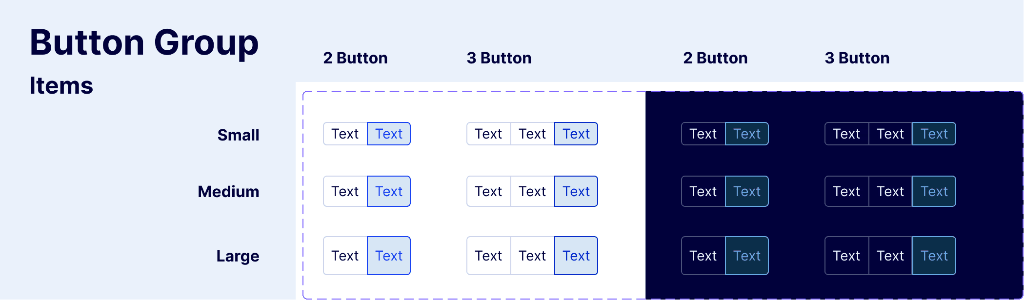
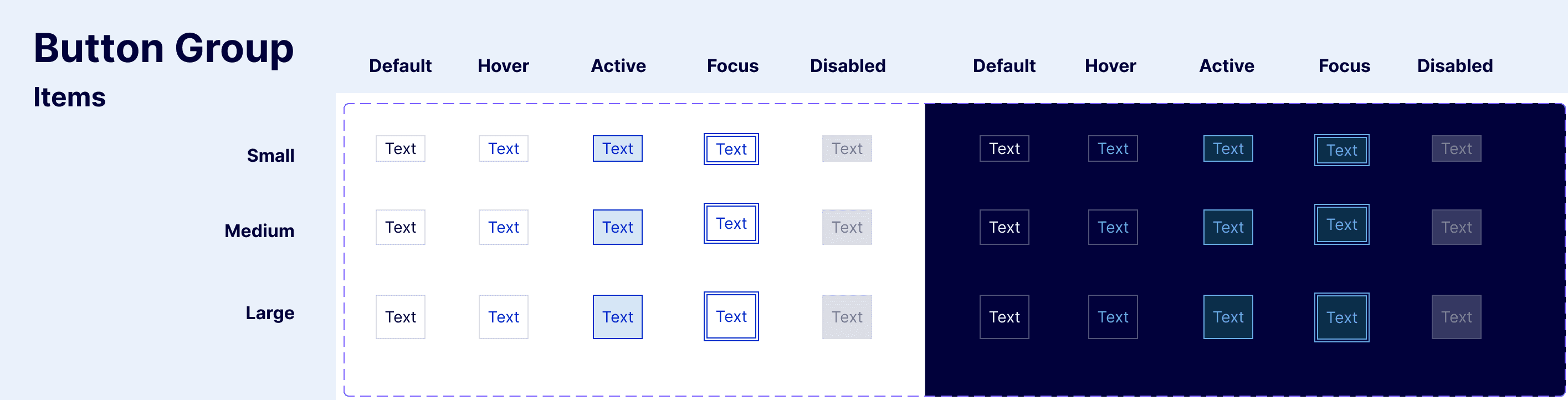
Component set annotation
Side and top labels allow at-a-glance recognition of component variants and options.
Component set annotation
Side and top labels allow at-a-glance recognition of component variants and options.
Overviews have component category definitions based on Atomic Methodology and a change log listing related components and their statuses.
Impact after six months
Based on data gleaned from Figma Analytics, adoption of Trellis 2.0 was successful with over 8,000 more inserts of components over the old component library. Responses the Bi-annual Trellis Design System Engagement Survey indicate positive reception for the library management initiatives and component improvements.
70%
70%
Keyboard navigation coverage enabled in UI
Previously 0% keyboard navigation in UI
89%
89%
Overall library compliance with Level AA WCAG
Success metric: 80% Min. WCAG AA
94%
94%
More Trellis 2.0 adoption compared to old library
11.9k Trellis 2.0 vs 4.3k Trellis 1.0 inserts
More Trellis 2.0 adoption compared to old library
11.9k Trellis 2.0 vs 4.3k Trellis 1.0 inserts
4.5
4.5
Design system components are easy to use
1=strongly disagree, 5=strongly agree
Design system components are easy to use
1=strongly disagree, 5=strongly agree
5.0
5.0
Component documentation is helpful
1=strongly disagree, 5=strongly agree
Component documentation is helpful
1=strongly disagree, 5=strongly agree
3.4
3.4

Overall satisfaction rating for Trellis Design System
1=strongly disagree, 5=strongly agree
Overall satisfaction rating for Trellis Design System
1=strongly disagree, 5=strongly agree
70%
Keyboard navigation coverage enabled in UI
Previously 0% keyboard navigation in UI
89%
Overall library compliance with Level AA WCAG
Success metric: 80% Min. WCAG AA
94%
More Trellis 2.0 adoption compared to old library
11.9k Trellis 2.0 vs 4.3k Trellis 1.0 inserts
4.5
Design system components are easy to use
1=strongly disagree, 5=strongly agree
5.0
Component documentation is helpful
1=strongly disagree, 5=strongly agree
3.4
Overall satisfaction rating for Trellis Design System
1=strongly disagree, 5=strongly agree