NEW RELIC / PLANS & PRICING
Designing a purchase experience to grow along with businesses
As a Lead/Staff Product Designer at New Relic, I was responsible for the research and redesign of the commerce user experience that helps buyers understand plan pricing, enables purchases and management of plans.
MY ROLE
Lead Product Designer
TEAM
Product Manager • 7 Engineers
USERS / PERSONAS
Engineering Managers, Software Engineers, Finance and Procurement Professionals
ACTIVITIES PERFORMED
UX Audit • Comparative Baseline Test • Workflows • Wireframes • High Fidelity Prototypes • Customer Calls • User Testing
How do we increase conversions of startup customers with an annual spend below $25k?
Buyers
Approves budgets and tools; has the power to buy monitoring solutions.
Eng Managers, Finance or Procurement Managers
Developer Users
Any software engineer using monitoring software for any part of their role in the last 30 days.
Software Eng
Influencers
Indirect but noted influence over purchases, gets approval with proposals
Lead Software Engs,
Eng Managers
Early signals from customer feedback serving as starting point for investigations.
Observations
Missing, outdated product details
Poor accessibility, awkward workflows
Some SKUs are only available to purchase by contacting Sales
Most <$25k spend customers prefer to self-serve purchases
Impact
Customers exit purchases to seek answers offsite; increasing likelihood of losing a sale.
Confusing, hard to read workflows
Sales suffer from additional overhead
Startups unlikely to convert without self-serve SKUs
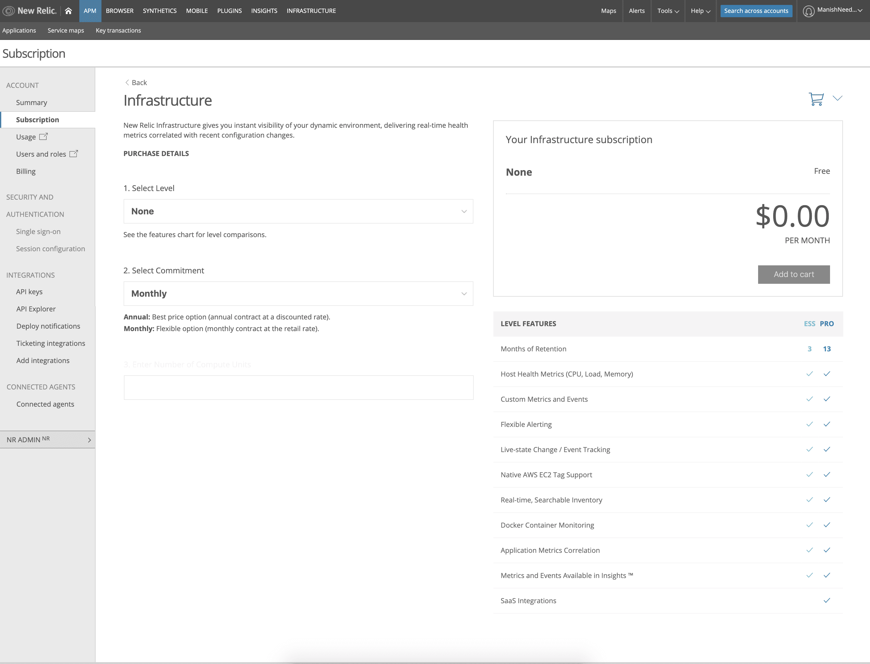
No starting price
The starting price isn't shown until afte the customer selects a level
Incentives lack emphasis
Annual commits were offered incentives to encourage purchase but lacked emphasis.
Hidden options
There are only two possible levels to present but both are hidden in the dropdown.
Hard to read
Level features are displayed but not very readable at this size.
Example of some notes captured in audit of prior UI. This process helped identify assumptions that could be validated through a comparative baseline testing.
Wireframes
I presented options for the redesigned experience for the browsing, viewing and adding subscriptions to cart and checkout workflows that are based on familiar workflows for purchasing products online.
Optimizations included list management functionality (pagination, filters/search, etc.) and adding descriptive, at-a-glance info to give more context for a purchase decision. A subscription calculator and toggle for monthly/annual pricing helps make it easier to predict price.
The cart view includes all items in the cart and the addition of upsell opportunities (add-ons). A simplified checkout focused on completing the purchase and the ability to edit items already in cart.
Post purchase, the user is prompted to configure their purchase or to make another buy. An abandoned cart workflow triggers if the user closes the window (abandoned cart email) or tries to navigate away from the page (internal modal).
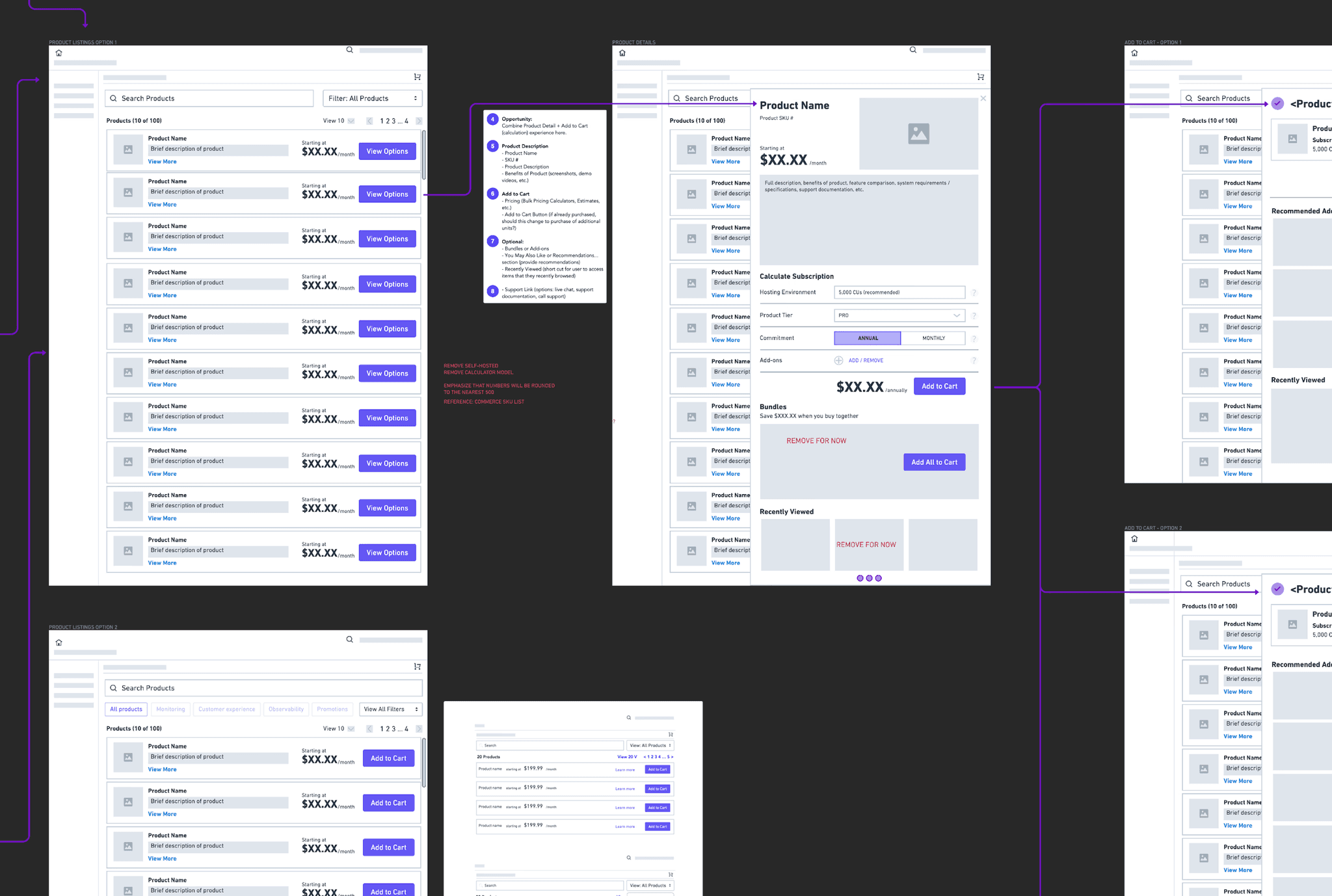
Example wireframes based on workflow diagrams.
High fidelity
The wireframes were translated into high fidelity mocks and prepped in InVision for user testing.
Video Prototype

Detail of product card

Early signals from customer feedback serving as starting point for investigations.
Observations
Missing, outdated product details
Poor accessibility, awkward workflows
Some SKUs are only available to purchase by contacting Sales
Most <$25k spend customers prefer to self-serve purchases
Impact
Customers exit purchases to seek answers offsite; increasing likelihood of losing a sale.
Confusing, hard to read workflows
Sales suffer from additional overhead
Startups unlikely to convert without self-serve SKUs

No starting price
The starting price isn't shown until afte the customer selects a level
Incentives lack emphasis
Annual commits were offered incentives to encourage purchase but lacked emphasis.
Hidden options
There are only two possible levels to present but both are hidden in the dropdown.
Hard to read
Level features are displayed but not very readable at this size.
Example of some notes captured in audit of prior UI. This process helped identify assumptions that could be validated through a comparative baseline testing.
Wireframes
I presented options for the redesigned experience for the browsing, viewing and adding subscriptions to cart and checkout workflows that are based on familiar workflows for purchasing products online.
Optimizations included list management functionality (pagination, filters/search, etc.) and adding descriptive, at-a-glance info to give more context for a purchase decision. A subscription calculator and toggle for monthly/annual pricing helps make it easier to predict price.
The cart view includes all items in the cart and the addition of upsell opportunities (add-ons). A simplified checkout focused on completing the purchase and the ability to edit items already in cart.
Post purchase, the user is prompted to configure their purchase or to make another buy. An abandoned cart workflow triggers if the user closes the window (abandoned cart email) or tries to navigate away from the page (internal modal).

Example wireframes based on workflow diagrams.
High fidelity
The wireframes were translated into high fidelity mocks and prepped in InVision for user testing.
Video Prototype

Detail of product card

Early signals from customer feedback serving as starting point for investigations.
Observations
Missing, outdated product details
Poor accessibility, awkward workflows
Some SKUs are only available to purchase by contacting Sales
Most <$25k spend customers prefer to self-serve purchases
Impact
Customers exit purchases to seek answers offsite; increasing likelihood of losing a sale.
Confusing, hard to read workflows
Sales suffer from additional overhead
Startups unlikely to convert without self-serve SKUs

No starting price
The starting price isn't shown until afte the customer selects a level
Incentives lack emphasis
Annual commits were offered incentives to encourage purchase but lacked emphasis.
Hidden options
There are only two possible levels to present but both are hidden in the dropdown.
Hard to read
Level features are displayed but not very readable at this size.
Example of some notes captured in audit of prior UI. This process helped identify assumptions that could be validated through a comparative baseline testing.
Wireframes
I presented options for the redesigned experience for the browsing, viewing and adding subscriptions to cart and checkout workflows that are based on familiar workflows for purchasing products online.
Optimizations included list management functionality (pagination, filters/search, etc.) and adding descriptive, at-a-glance info to give more context for a purchase decision. A subscription calculator and toggle for monthly/annual pricing helps make it easier to predict price.
The cart view includes all items in the cart and the addition of upsell opportunities (add-ons). A simplified checkout focused on completing the purchase and the ability to edit items already in cart.
Post purchase, the user is prompted to configure their purchase or to make another buy. An abandoned cart workflow triggers if the user closes the window (abandoned cart email) or tries to navigate away from the page (internal modal).

Example wireframes based on workflow diagrams.
High fidelity
The wireframes were translated into high fidelity mocks and prepped in InVision for user testing.
Video Prototype

Detail of product card

Early signals from customer feedback serving as starting point for investigations.
Observations
Missing, outdated product details
Poor accessibility, awkward workflows
Some SKUs are only available to purchase by contacting Sales
Most <$25k spend customers prefer to self-serve purchases
Impact
Customers exit purchases to seek answers offsite; increasing likelihood of losing a sale.
Confusing, hard to read workflows
Sales suffer from additional overhead
Startups unlikely to convert without self-serve SKUs

No starting price
The starting price isn't shown until afte the customer selects a level
Incentives lack emphasis
Annual commits were offered incentives to encourage purchase but lacked emphasis.
Hidden options
There are only two possible levels to present but both are hidden in the dropdown.
Hard to read
Level features are displayed but not very readable at this size.
Example of some notes captured in audit of prior UI. This process helped identify assumptions that could be validated through a comparative baseline testing.
Wireframes
I presented options for the redesigned experience for the browsing, viewing and adding subscriptions to cart and checkout workflows that are based on familiar workflows for purchasing products online.
Optimizations included list management functionality (pagination, filters/search, etc.) and adding descriptive, at-a-glance info to give more context for a purchase decision. A subscription calculator and toggle for monthly/annual pricing helps make it easier to predict price.
The cart view includes all items in the cart and the addition of upsell opportunities (add-ons). A simplified checkout focused on completing the purchase and the ability to edit items already in cart.
Post purchase, the user is prompted to configure their purchase or to make another buy. An abandoned cart workflow triggers if the user closes the window (abandoned cart email) or tries to navigate away from the page (internal modal).

Example wireframes based on workflow diagrams.
High fidelity
The wireframes were translated into high fidelity mocks and prepped in InVision for user testing.
Video Prototype

Detail of product card

Early signals from customer feedback serving as starting point for investigations.
Observations
Missing, outdated product details
Poor accessibility, awkward workflows
Some product SKUs were only available to purchase by contacting Sales
Most <$25k spend customers prefer to self-serve all their purchases
Impact
Customers exit purchases to seek answers offsite; increasing likelihood of losing a sale.
Confusing, hard to read workflows
Sales suffer from additional overhead
Startups unlikely to convert without self-serve SKUs

No starting price
The starting price isn't shown until afte the customer selects a level
Incentives lack emphasis
Annual commits were offered incentives to encourage purchase but lacked emphasis.
Hidden options
There are only two possible levels to present but both are hidden in the dropdown.
Hard to read
Level features are displayed but not very readable at this size.
Example of some notes captured in audit of prior UI. This process helped identify assumptions that could be validated through a comparative baseline testing.
Wireframes
I presented options for the redesigned experience for the browsing, viewing and adding subscriptions to cart and checkout workflows that are based on familiar workflows for purchasing products online.
Optimizations included list management functionality (pagination, filters/search, etc.) and adding descriptive, at-a-glance info to give more context for a purchase decision. A subscription calculator and toggle for monthly/annual pricing helps make it easier to predict price.
The cart view includes all items in the cart and the addition of upsell opportunities (add-ons). A simplified checkout focused on completing the purchase and the ability to edit items already in cart.
Post purchase, the user is prompted to configure their purchase or to make another buy. An abandoned cart workflow triggers if the user closes the window (abandoned cart email) or tries to navigate away from the page (internal modal).

Example wireframes based on workflow diagrams.
High fidelity mocks
The wireframes were translated into high fidelity mocks and prepped in InVision for user testing.
Video Prototype

Detail of product card
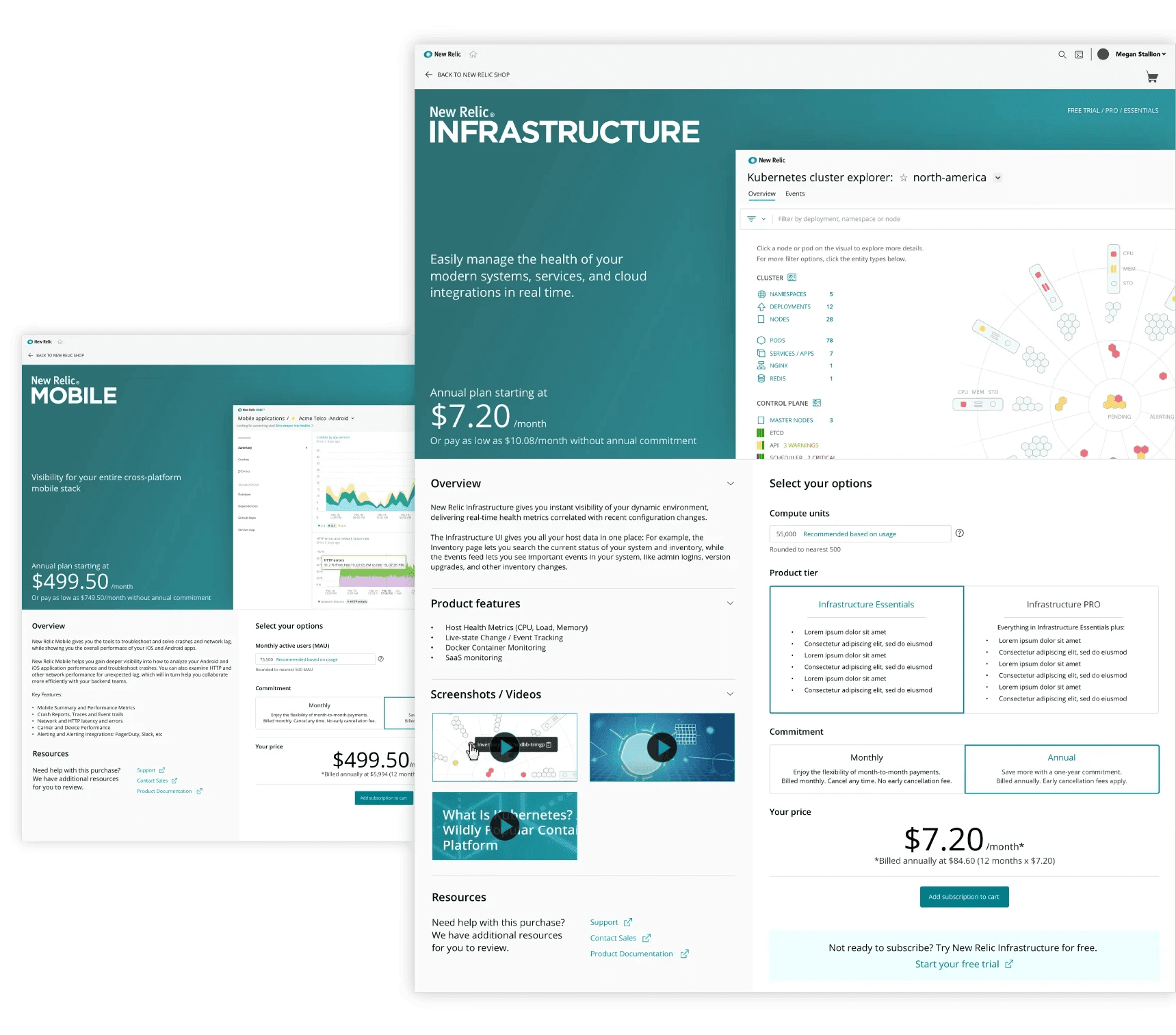
Early signals from customer feedback serving as starting point for investigations.
Observations
Missing, outdated product details
Poor accessibility, awkward workflows
Some product SKUs were only available to purchase by contacting Sales
Most <$25k spend customers prefer to self-serve all their purchases
Impact
Customers exit purchases to seek answers offsite; increasing likelihood of losing a sale.
Confusing, hard to read workflows
Sales suffer from additional overhead
Startups unlikely to convert without self-serve SKUs

No starting price
The starting price isn't shown until afte the customer selects a level
Incentives lack emphasis
Annual commits were offered incentives to encourage purchase but lacked emphasis.
Hidden options
There are only two possible levels to present but both are hidden in the dropdown.
Hard to read
Level features are displayed but not very readable at this size.
Example of some notes captured in audit of prior UI. This process helped identify assumptions that could be validated through a comparative baseline testing.
Wireframes
I presented options for the redesigned experience for the browsing, viewing and adding subscriptions to cart and checkout workflows that are based on familiar workflows for purchasing products online.
Optimizations included list management functionality (pagination, filters/search, etc.) and adding descriptive, at-a-glance info to give more context for a purchase decision. A subscription calculator and toggle for monthly/annual pricing helps make it easier to predict price.
The cart view includes all items in the cart and the addition of upsell opportunities (add-ons). A simplified checkout focused on completing the purchase and the ability to edit items already in cart.
Post purchase, the user is prompted to configure their purchase or to make another buy. An abandoned cart workflow triggers if the user closes the window (abandoned cart email) or tries to navigate away from the page (internal modal).

Example wireframes based on workflow diagrams.
High fidelity mocks
The wireframes were translated into high fidelity mocks and prepped in InVision for user testing.
Video Prototype

Detail of product card

Early signals from customer feedback serving as starting point for investigations.
Observations
Missing, outdated product details
Poor accessibility, awkward workflows
Some product SKUs were only available to purchase by contacting Sales
Most <$25k spend customers prefer to self-serve all their purchases
Impact
Customers exit purchases to seek answers offsite; increasing likelihood of losing a sale.
Confusing, hard to read workflows
Sales suffer from additional overhead
Startups unlikely to convert without self-serve SKUs

No starting price
The starting price isn't shown until afte the customer selects a level
Incentives lack emphasis
Annual commits were offered incentives to encourage purchase but lacked emphasis.
Hidden options
There are only two possible levels to present but both are hidden in the dropdown.
Hard to read
Level features are displayed but not very readable at this size.
Example of some notes captured in audit of prior UI. This process helped identify assumptions that could be validated through a comparative baseline testing.
Wireframes
I presented options for the redesigned experience for the browsing, viewing and adding subscriptions to cart and checkout workflows that are based on familiar workflows for purchasing products online.
Optimizations included list management functionality (pagination, filters/search, etc.) and adding descriptive, at-a-glance info to give more context for a purchase decision. A subscription calculator and toggle for monthly/annual pricing helps make it easier to predict price.
The cart view includes all items in the cart and the addition of upsell opportunities (add-ons). A simplified checkout focused on completing the purchase and the ability to edit items already in cart.
Post purchase, the user is prompted to configure their purchase or to make another buy. An abandoned cart workflow triggers if the user closes the window (abandoned cart email) or tries to navigate away from the page (internal modal).

Example wireframes based on workflow diagrams.
High fidelity mocks
The wireframes were translated into high fidelity mocks and prepped in InVision for user testing.
Video Prototype

Detail of product card

Early signals from customer feedback serving as starting point for investigations.
Observations
Missing, outdated product details
Poor accessibility, awkward workflows
Some product SKUs were only available to purchase by contacting Sales
Most <$25k spend customers prefer to self-serve all their purchases
Impact
Customers exit purchases to seek answers offsite; increasing likelihood of losing a sale.
Confusing, hard to read workflows
Sales suffer from additional overhead
Startups unlikely to convert without self-serve SKUs

No starting price
The starting price isn't shown until afte the customer selects a level
Incentives lack emphasis
Annual commits were offered incentives to encourage purchase but lacked emphasis.
Hidden options
There are only two possible levels to present but both are hidden in the dropdown.
Hard to read
Level features are displayed but not very readable at this size.
Example of some notes captured in audit of prior UI. This process helped identify assumptions that could be validated through a comparative baseline testing.
Wireframes
I presented options for the redesigned experience for the browsing, viewing and adding subscriptions to cart and checkout workflows that are based on familiar workflows for purchasing products online.
Optimizations included list management functionality (pagination, filters/search, etc.) and adding descriptive, at-a-glance info to give more context for a purchase decision. A subscription calculator and toggle for monthly/annual pricing helps make it easier to predict price.
The cart view includes all items in the cart and the addition of upsell opportunities (add-ons). A simplified checkout focused on completing the purchase and the ability to edit items already in cart.
Post purchase, the user is prompted to configure their purchase or to make another buy. An abandoned cart workflow triggers if the user closes the window (abandoned cart email) or tries to navigate away from the page (internal modal).

Example wireframes based on workflow diagrams.
High fidelity mocks
The wireframes were translated into high fidelity mocks and prepped in InVision for user testing.
Video Prototype

Detail of product card

Early signals from customer feedback serving as starting point for investigations.
Impact
Customers exit purchases to seek answers offsite; increasing likelihood of losing a sale.
Confusing, hard to read workflows
Sales suffer from additional overhead
Startups unlikely to convert without self-serve SKUs
Observations
Missing, outdated product details
Poor accessibility, awkward workflows
Some SKUs are only available to purchase by contacting Sales
Most <$25k spend customers prefer to self-serve purchases

Example of prior UI captured in the audit. This process helped identify assumptions that could be validated through a comparative baseline testing.
High fidelity
The wireframes were translated into high fidelity mocks and prepped in InVision for user testing.
Video Prototype
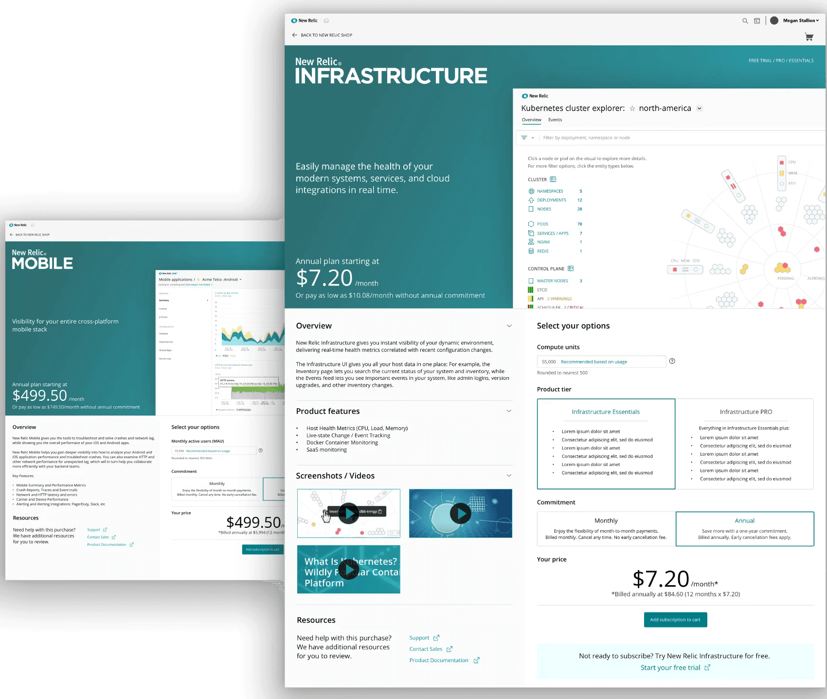

Detail of product card
Wireframes
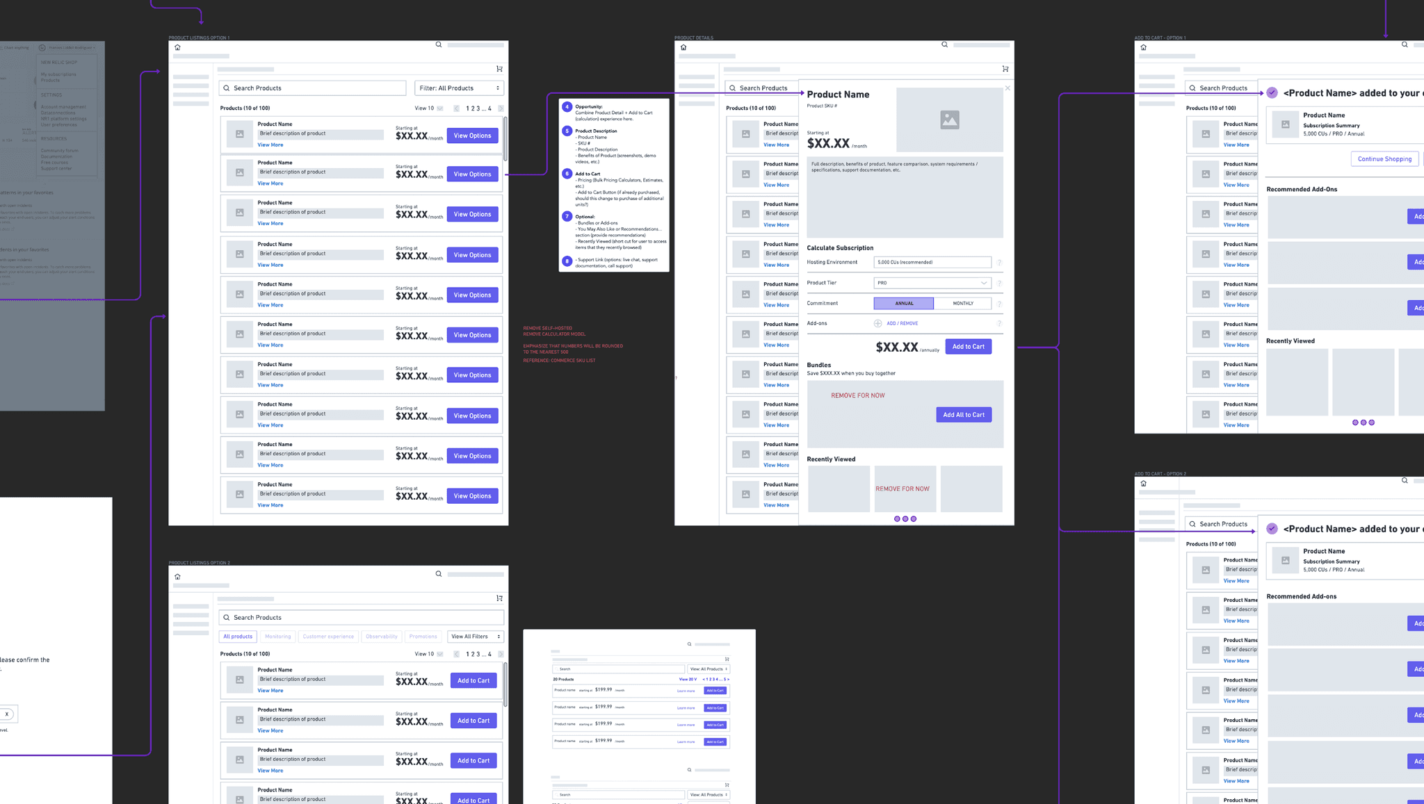
I presented options for the redesigned experience for the browsing, viewing and adding subscriptions to cart and checkout workflows that are based on familiar workflows for purchasing products online.
Optimizations included list management functionality (pagination, filters/search, etc.) and adding descriptive, at-a-glance info to give more context for a purchase decision. A subscription calculator and toggle for monthly/annual pricing helps make it easier to predict price.
The cart view includes all items in the cart and the addition of upsell opportunities (add-ons). A simplified checkout focused on completing the purchase and the ability to edit items already in cart.
Post purchase, the user is prompted to configure their purchase or to make another buy. An abandoned cart workflow triggers if the user closes the window (abandoned cart email) or tries to navigate away from the page (internal modal).
Example wireframes based on workflow diagrams.

Progress is not always a straight line

Leadership announces a new pricing model…
SKU Based Pricing
(old model)
Fixed-rate based on number of units
Only access purchased SKUs
A storefront with individual products
Free unlimited Full users
Consumption Based Pricing
(New model)
Pay-as-you-go based on system usage
Get access to entire platform
Free, Standard, Pro & Enterprise tiers
Pay for Full users; Basic users free
… and we would have to shift gears to support customers under the new model.
Comparative Baseline Study
Overall, the participants preferred the new UI to the old one, noting improvements to checkout process and browsing purchases to be most helpful. With these results, we felt confident in moving forward with the new storefront designs.
Participant Users (4)
Tasks (2)
2 existing New Relic customers
2 prospective customers
Purchase an annual subscription of APM Pro in existing user experience
Repeat purchase in the proposed new user experience
Rate difficulty from 1 to 5.
(1= difficult and 5= easy)
4.25
Proposed
2.25
Existing
Which experience do
you prefer?
100%
Proposed
0%
Existing
Successfully completed
the purchase.
100%
Proposed
75%
Existing
Early signals from customer feedback serving as starting point for investigations.
Observations
Missing, outdated product details
Poor accessibility, awkward workflows
Some product SKUs were only available to purchase by contacting Sales
Most <$25k spend customers prefer to self-serve all their purchases
Impact
Customers exit purchases to seek answers offsite; increasing likelihood of losing a sale.
Confusing, hard to read workflows
Sales suffer from additional overhead
Startups unlikely to convert without self-serve SKUs
Wireframes
I presented options for the redesigned experience for the browsing, viewing and adding subscriptions to cart and checkout workflows that are based on familiar workflows for purchasing products online.
Optimizations included list management functionality (pagination, filters/search, etc.) and adding descriptive, at-a-glance info to give more context for a purchase decision. A subscription calculator and toggle for monthly/annual pricing helps make it easier to predict price.
The cart view includes all items in the cart and the addition of upsell opportunities (add-ons). A simplified checkout focused on completing the purchase and the ability to edit items already in cart.
Post purchase, the user is prompted to configure their purchase or to make another buy. An abandoned cart workflow triggers if the user closes the window (abandoned cart email) or tries to navigate away from the page (internal modal).

Example wireframes based on workflow diagrams.
High fidelity mocks
The wireframes were translated into high fidelity mocks and prepped in InVision for user testing.
Video Prototype

Detail of product card

Early signals from customer feedback serving as starting point for investigations.
Observations
Missing, outdated product details
Poor accessibility, awkward workflows
Some product SKUs were only available to purchase by contacting Sales
Most <$25k spend customers prefer to self-serve all their purchases
Impact
Customers exit purchases to seek answers offsite; increasing likelihood of losing a sale.
Confusing, hard to read workflows
Sales suffer from additional overhead
Startups unlikely to convert without self-serve SKUs
Wireframes
I presented options for the redesigned experience for the browsing, viewing and adding subscriptions to cart and checkout workflows that are based on familiar workflows for purchasing products online.
Optimizations included list management functionality (pagination, filters/search, etc.) and adding descriptive, at-a-glance info to give more context for a purchase decision. A subscription calculator and toggle for monthly/annual pricing helps make it easier to predict price.
The cart view includes all items in the cart and the addition of upsell opportunities (add-ons). A simplified checkout focused on completing the purchase and the ability to edit items already in cart.
Post purchase, the user is prompted to configure their purchase or to make another buy. An abandoned cart workflow triggers if the user closes the window (abandoned cart email) or tries to navigate away from the page (internal modal).

Example wireframes based on workflow diagrams.
High fidelity mocks
The wireframes were translated into high fidelity mocks and prepped in InVision for user testing.
Video Prototype

Detail of product card

Early signals from customer feedback serving as starting point for investigations.
Observations
Missing, outdated product details
Poor accessibility, awkward workflows
Some product SKUs were only available to purchase by contacting Sales
Most <$25k spend customers prefer to self-serve all their purchases
Impact
Customers exit purchases to seek answers offsite; increasing likelihood of losing a sale.
Confusing, hard to read workflows
Sales suffer from additional overhead
Startups unlikely to convert without self-serve SKUs
Wireframes
I presented options for the redesigned experience for the browsing, viewing and adding subscriptions to cart and checkout workflows that are based on familiar workflows for purchasing products online.
Optimizations included list management functionality (pagination, filters/search, etc.) and adding descriptive, at-a-glance info to give more context for a purchase decision. A subscription calculator and toggle for monthly/annual pricing helps make it easier to predict price.
The cart view includes all items in the cart and the addition of upsell opportunities (add-ons). A simplified checkout focused on completing the purchase and the ability to edit items already in cart.
Post purchase, the user is prompted to configure their purchase or to make another buy. An abandoned cart workflow triggers if the user closes the window (abandoned cart email) or tries to navigate away from the page (internal modal).

Example wireframes based on workflow diagrams.
High fidelity mocks
The wireframes were translated into high fidelity mocks and prepped in InVision for user testing.
Video Prototype

Detail of product card

Early signals from customer feedback serving as starting point for investigations.
Observations
Missing, outdated product details
Poor accessibility, awkward workflows
Some product SKUs were only available to purchase by contacting Sales
Most <$25k spend customers prefer to self-serve all their purchases
Impact
Customers exit purchases to seek answers offsite; increasing likelihood of losing a sale.
Confusing, hard to read workflows
Sales suffer from additional overhead
Startups unlikely to convert without self-serve SKUs
Wireframes
I presented options for the redesigned experience for the browsing, viewing and adding subscriptions to cart and checkout workflows that are based on familiar workflows for purchasing products online.
Optimizations included list management functionality (pagination, filters/search, etc.) and adding descriptive, at-a-glance info to give more context for a purchase decision. A subscription calculator and toggle for monthly/annual pricing helps make it easier to predict price.
The cart view includes all items in the cart and the addition of upsell opportunities (add-ons). A simplified checkout focused on completing the purchase and the ability to edit items already in cart.
Post purchase, the user is prompted to configure their purchase or to make another buy. An abandoned cart workflow triggers if the user closes the window (abandoned cart email) or tries to navigate away from the page (internal modal).

Example wireframes based on workflow diagrams.
High fidelity mocks
The wireframes were translated into high fidelity mocks and prepped in InVision for user testing.
Video Prototype

Detail of product card

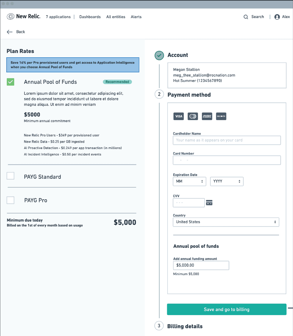
New wireframes
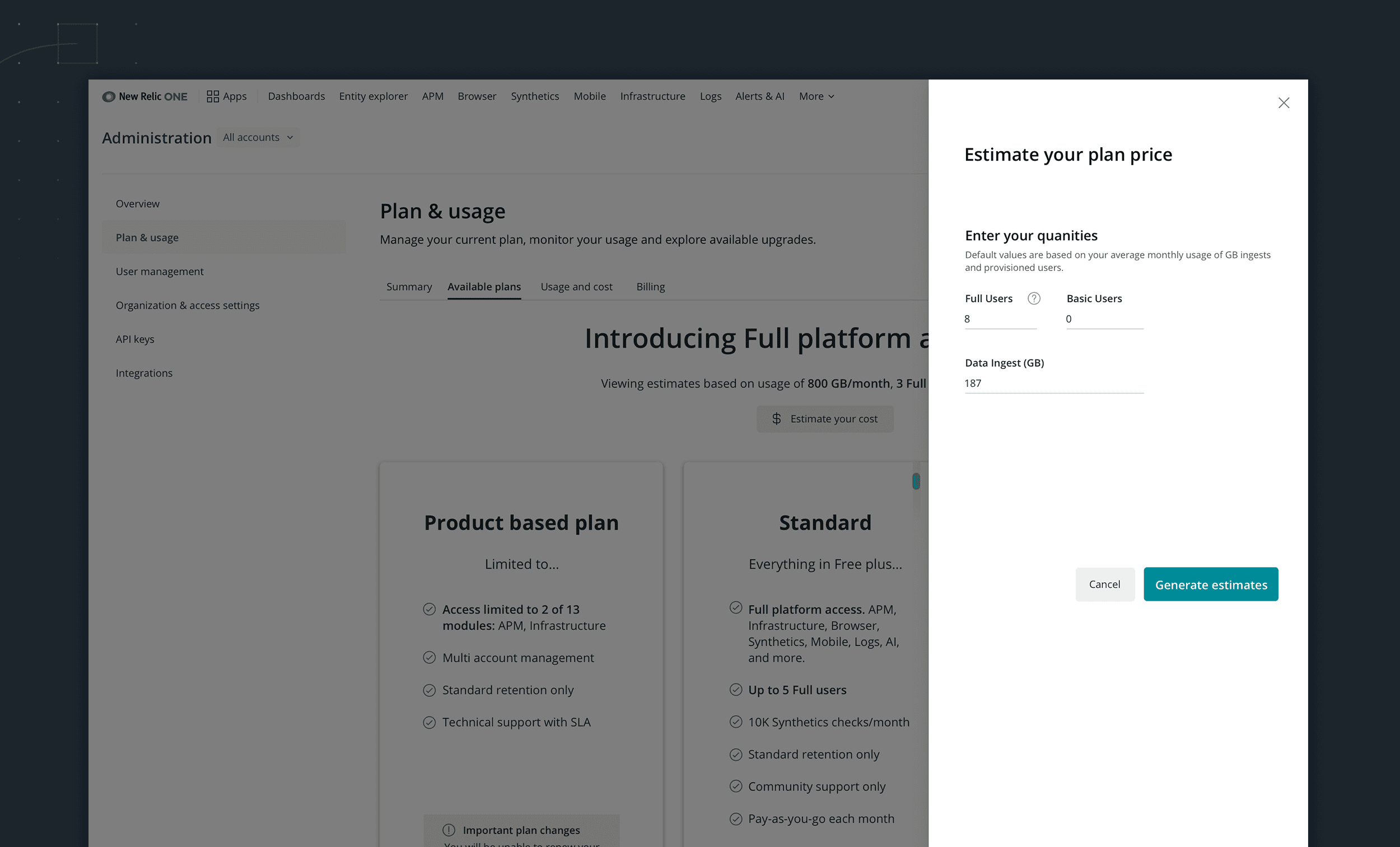
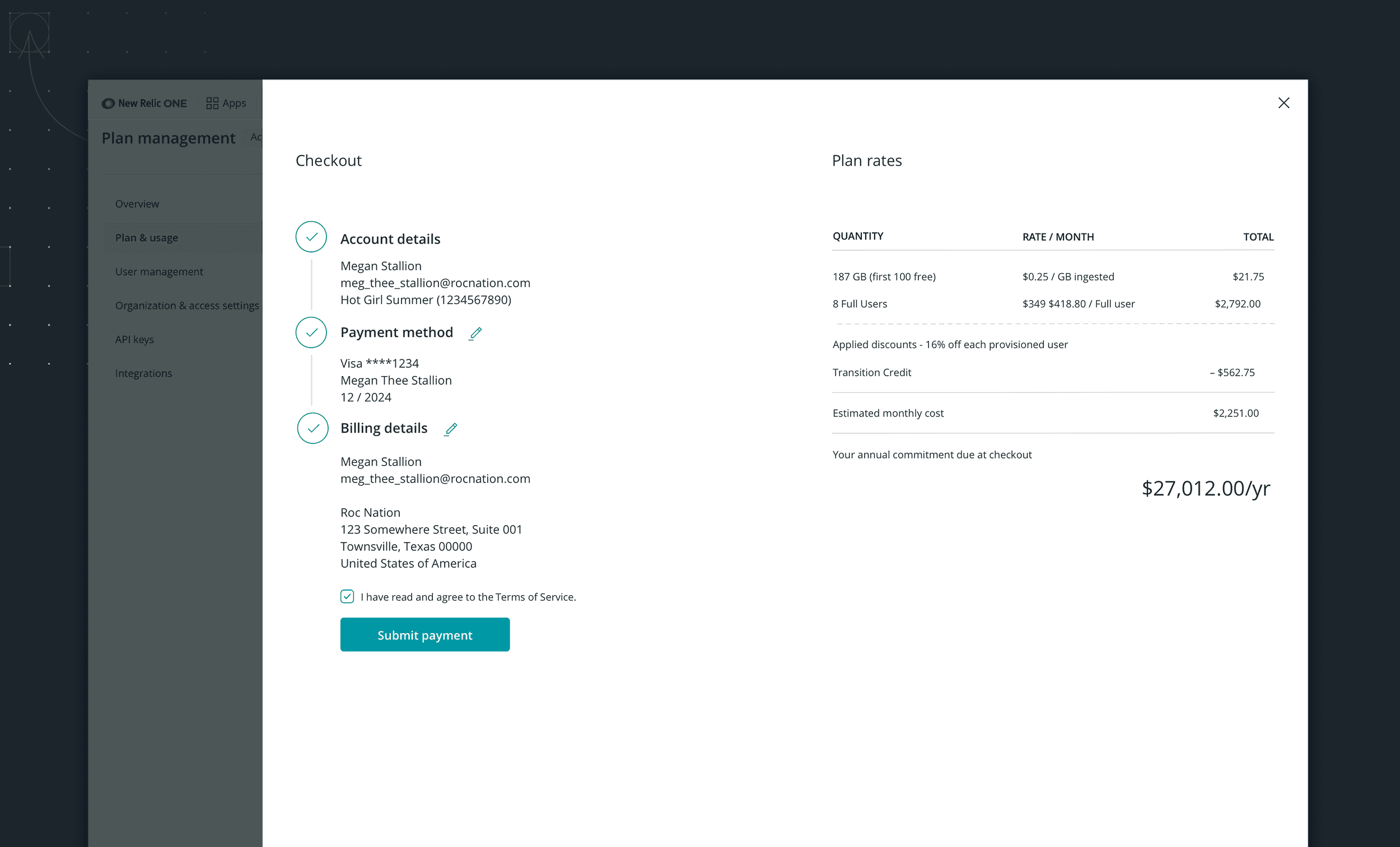
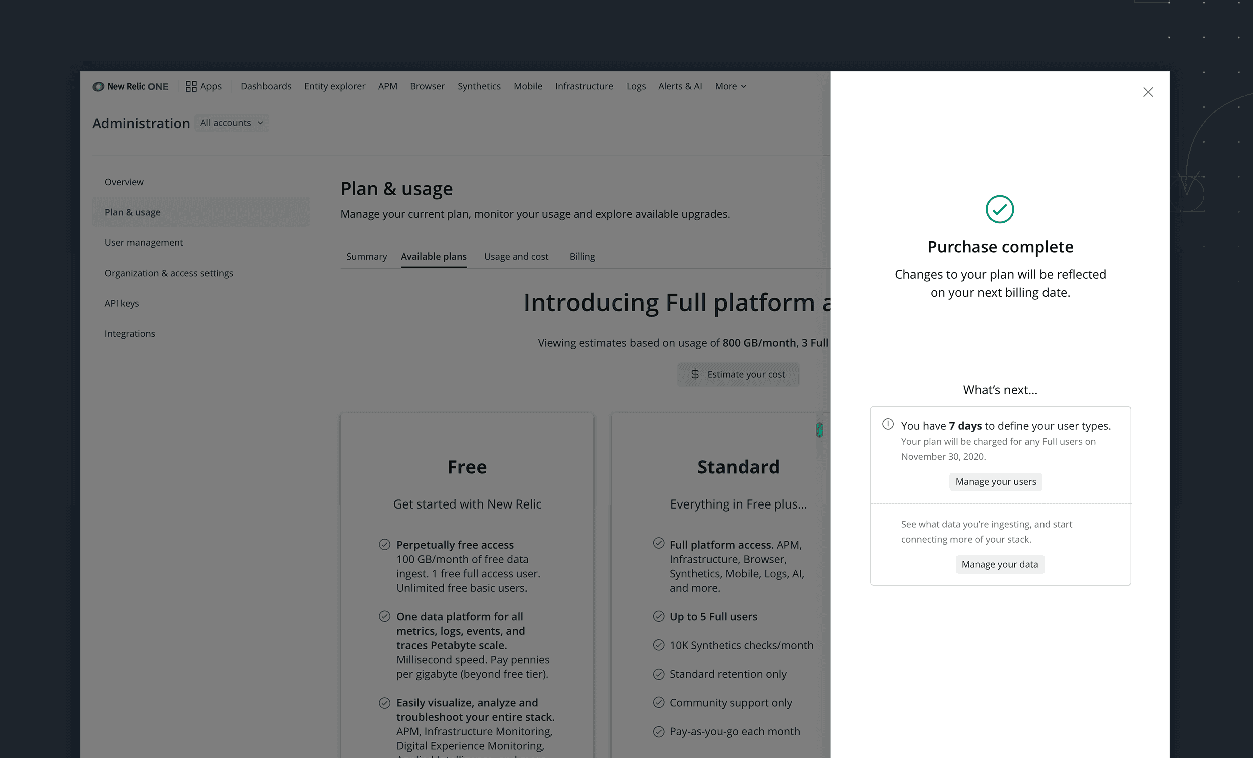
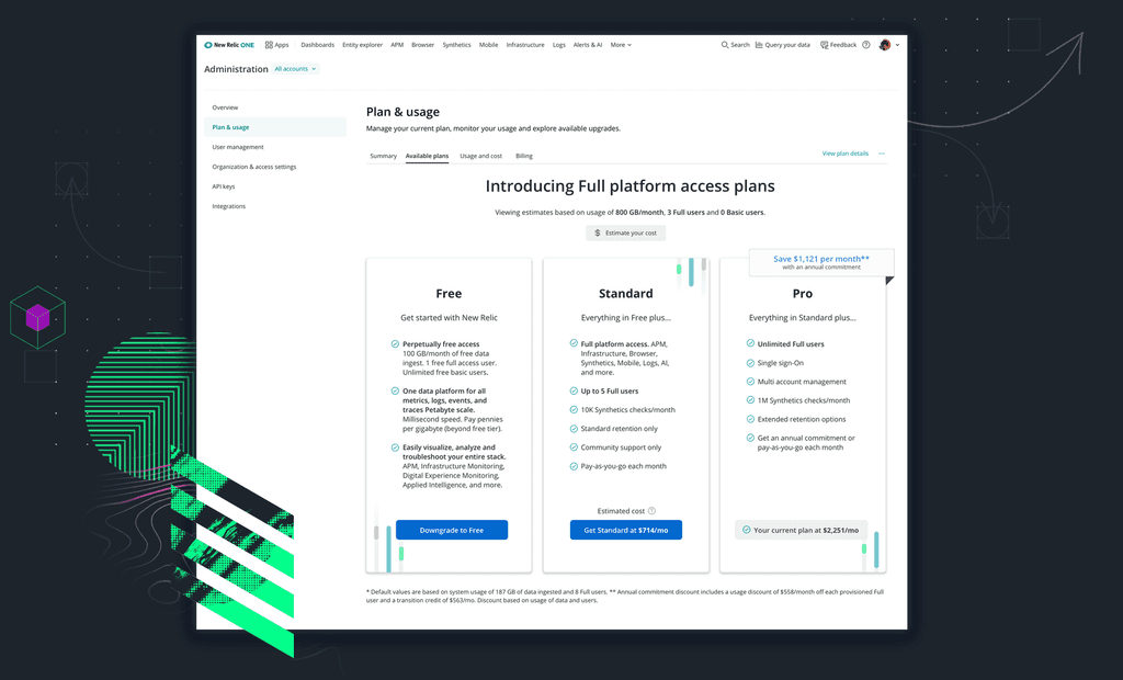
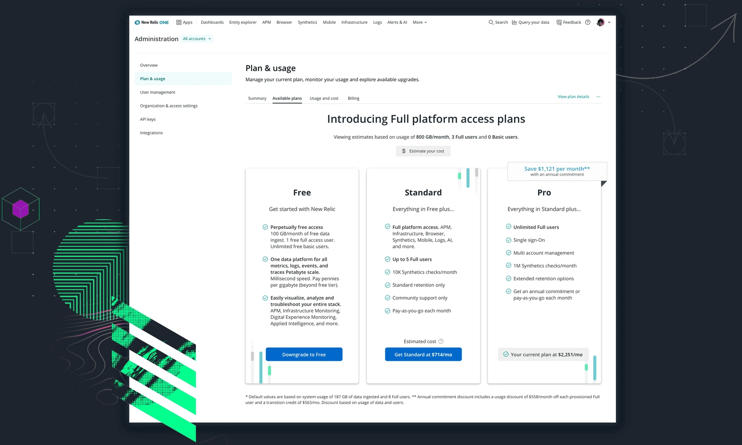
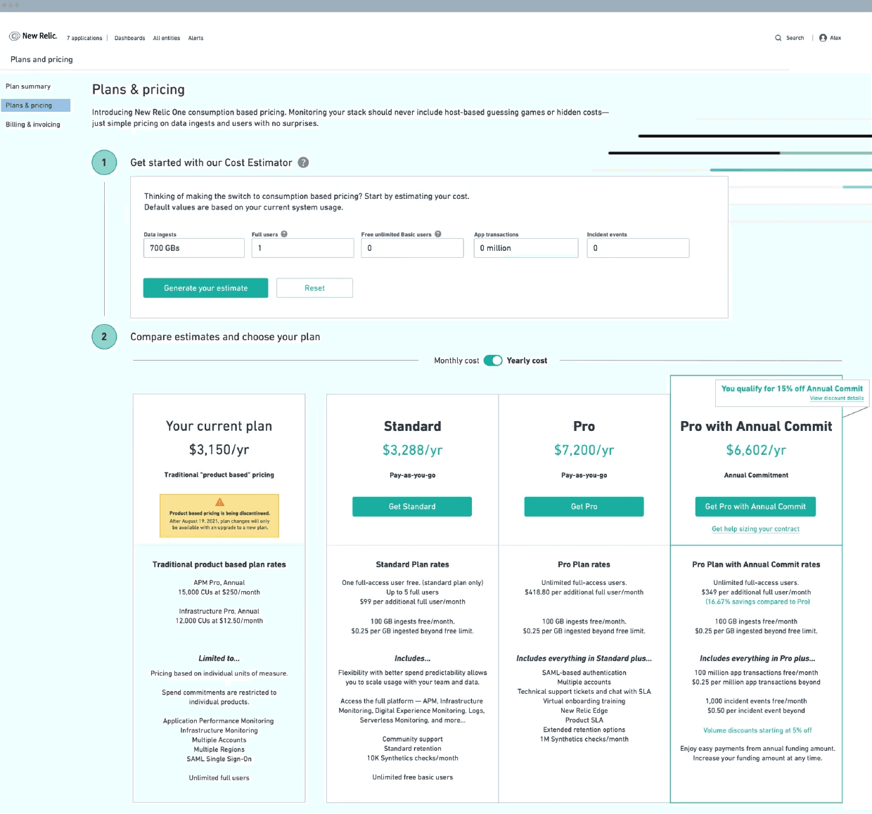
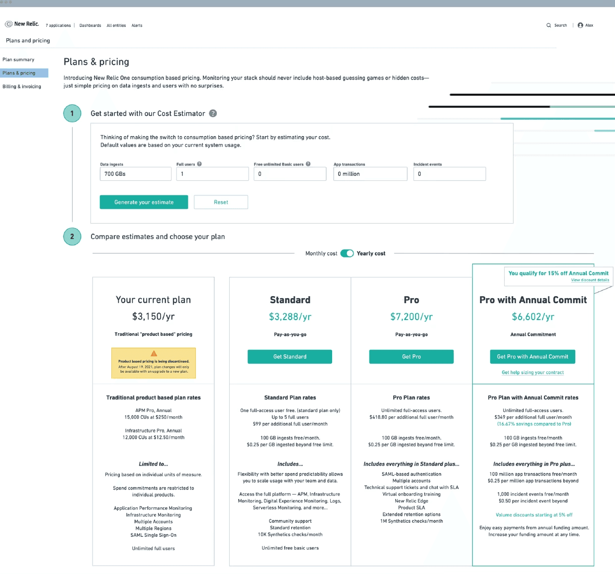
I did a few explorations of a tiered plan pricing page to replace the storefront and product detail pages. We landed on an option that included optimizations to allow for existing customers to migrate to the new model.
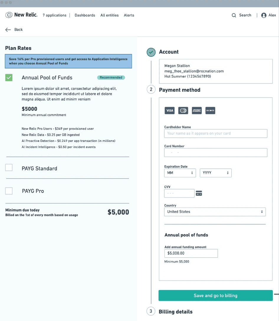
Vertically stacked tiered pricing layout concept that was explored but eventually went with a classic horizontal layout.
Comparative Baseline Study
Overall, the participants preferred the new UI to the old one, noting improvements to checkout process and browsing purchases to be most helpful. With these results, we felt confident in moving forward with the new storefront designs.
Participant Users (4)
Tasks (2)
2 existing New Relic customers
2 prospective customers
Purchase an annual subscription of APM Pro in existing UI
Repeat purchase in the proposed new UI
Rate difficulty from 1 to 5.
(1= difficult and 5= easy)
4.25
Proposed
2.25
Existing
Which experience do
you prefer?
100%
Proposed
0%
Existing
Successfully completed
the purchase.
100%
Proposed
75%
Existing

Progress is not always a straight line.

Leadership announces a new pricing model…
SKU Based Pricing
(old model)
Fixed-rate based on number of units
Only access purchased SKUs
A storefront with individual products
Free unlimited Full users
Consumption Based Pricing
(New model)
Pay-as-you-go based on system usage
Get access to entire platform
Free, Standard, Pro & Enterprise tiers
Pay for Full users; Basic users free
… and we would have to shift gears to support customers under the new model.
New wireframes
I did a few explorations of a tiered plan pricing page to replace the storefront and product detail pages. We landed on an option that included optimizations to allow for existing customers to migrate to the new model.

Vertically stacked tiered pricing layout concept that was explored but eventually went with a classic horizontal layout.

Progress is not always a straight line.

Leadership announces a new pricing model…
SKU Based Pricing
(old model)
Fixed-rate based on number of units
Only access purchased SKUs
A storefront with individual products
Free unlimited Full users
Consumption Based Pricing
(New model)
Pay-as-you-go based on system usage
Get access to entire platform
Free, Standard, Pro & Enterprise tiers
Pay for Full users; Basic users free
… and we would have to shift gears to support customers under the new model.
New wireframes
I did a few explorations of a tiered plan pricing page to replace the storefront and product detail pages. We landed on an option that included optimizations to allow for existing customers to migrate to the new model.

Vertically stacked tiered pricing layout concept that was explored but eventually went with a classic horizontal layout.


Progress is not always a straight line.

Leadership announces a new pricing model…
SKU Based Pricing
(old model)
Fixed-rate based on number of units
Only access purchased SKUs
A storefront with individual products
Free unlimited Full users
Consumption Based Pricing
(New model)
Pay-as-you-go based on system usage
Get access to entire platform
Free, Standard, Pro & Enterprise tiers
Pay for Full users; Basic users free
… and we would have to shift gears to support customers under the new model.
New wireframes
I did a few explorations of a tiered plan pricing page to replace the storefront and product detail pages. We landed on an option that included optimizations to allow for existing customers to migrate to the new model.

Vertically stacked tiered pricing layout concept that was explored but eventually went with a classic horizontal layout.


Progress is not always a straight line.

Leadership announces a new pricing model…
SKU Based Pricing
(old model)
Fixed-rate based on number of units
Only access purchased SKUs
A storefront with individual products
Free unlimited Full users
Consumption Based Pricing
(New model)
Pay-as-you-go based on system usage
Get access to entire platform
Free, Standard, Pro & Enterprise tiers
Pay for Full users; Basic users free
… and we would have to shift gears to support customers under the new model.
New wireframes
I did a few explorations of a tiered plan pricing page to replace the storefront and product detail pages. We landed on an option that included optimizations to allow for existing customers to migrate to the new model.

Vertically stacked tiered pricing layout concept that was explored but eventually went with a classic horizontal layout.


Progress is not always a straight line.

Leadership announces a new pricing model…
SKU Based Pricing
(old model)
Fixed-rate based on number of units
Only access purchased SKUs
A storefront with individual products
Free unlimited Full users
Consumption Based Pricing
(New model)
Pay-as-you-go based on system usage
Get access to entire platform
Free, Standard, Pro & Enterprise tiers
Pay for Full users; Basic users free
… and we would have to shift gears to support customers under the new model.
New wireframes
I did a few explorations of a tiered plan pricing page to replace the storefront and product detail pages. We landed on an option that included optimizations to allow for existing customers to migrate to the new model.
Vertically stacked tiered pricing layout concept that was explored but eventually went with a classic horizontal layout.


Progress is not always a straight line.

Leadership announces a new pricing model…
SKU Based Pricing
(old model)
Fixed-rate based on number of units
Only access purchased SKUs
A storefront with individual products
Free unlimited Full users
Consumption Based Pricing
(New model)
Pay-as-you-go based on system usage
Get access to entire platform
Free, Standard, Pro & Enterprise tiers
Pay for Full users; Basic users free
… and we would have to shift gears to support customers under the new model.
New wireframes
I did a few explorations of a tiered plan pricing page to replace the storefront and product detail pages. We landed on an option that included optimizations to allow for existing customers to migrate to the new model.

Vertically stacked tiered pricing layout concept that was explored but eventually went with a classic horizontal layout.


Progress is not always a straight line.

Leadership announces a new pricing model…
SKU Based Pricing
(old model)
Fixed-rate based on number of units
Only access purchased SKUs
A storefront with individual products
Free unlimited Full users
Consumption Based Pricing
(New model)
Pay-as-you-go based on system usage
Get access to entire platform
Free, Standard, Pro & Enterprise tiers
Pay for Full users; Basic users free
… and we would have to shift gears to support customers under the new model.
New wireframes
I did a few explorations of a tiered plan pricing page to replace the storefront and product detail pages. We landed on an option that included optimizations to allow for existing customers to migrate to the new model.

Vertically stacked tiered pricing layout concept that was explored but eventually went with a classic horizontal layout.


Progress is not always a straight line.

Leadership announces a new pricing model…
SKU Based Pricing
(old model)
Fixed-rate based on number of units
Only access purchased SKUs
A storefront with individual products
Free unlimited Full users
Consumption Based Pricing
(New model)
Pay-as-you-go based on system usage
Get access to entire platform
Free, Standard, Pro & Enterprise tiers
Pay for Full users; Basic users free
… and we would have to shift gears to support customers under the new model.
New wireframes
I did a few explorations of a tiered plan pricing page to replace the storefront and product detail pages. We landed on an option that included optimizations to allow for existing customers to migrate to the new model.

Vertically stacked tiered pricing layout concept that was explored but eventually went with a classic horizontal layout.

New Relic Plans and Pricing
A redesigned subscription experience that allows customers to scale their services at the pace of their organizational growth.
Early signals from customer feedback serving as starting point for investigations.
Observations
Missing, outdated product details
Poor accessibility, awkward workflows
Some product SKUs were only available to purchase by contacting Sales
Most <$25k spend customers prefer to self-serve all their purchases
Impact
Customers exit purchases to seek answers offsite; increasing likelihood of losing a sale.
Confusing, hard to read workflows
Sales suffer from additional overhead
Startups unlikely to convert without self-serve SKUs
Wireframes
I presented options for the redesigned experience for the browsing, viewing and adding subscriptions to cart and checkout workflows that are based on familiar workflows for purchasing products online.
Optimizations included list management functionality (pagination, filters/search, etc.) and adding descriptive, at-a-glance info to give more context for a purchase decision. A subscription calculator and toggle for monthly/annual pricing helps make it easier to predict price.
The cart view includes all items in the cart and the addition of upsell opportunities (add-ons). A simplified checkout focused on completing the purchase and the ability to edit items already in cart.
Post purchase, the user is prompted to configure their purchase or to make another buy. An abandoned cart workflow triggers if the user closes the window (abandoned cart email) or tries to navigate away from the page (internal modal).

Example wireframes based on workflow diagrams.
High fidelity mocks
The wireframes were translated into high fidelity mocks and prepped in InVision for user testing.
Video Prototype

Detail of product card

Early signals from customer feedback serving as starting point for investigations.
Observations
Missing, outdated product details
Poor accessibility, awkward workflows
Some product SKUs were only available to purchase by contacting Sales
Most <$25k spend customers prefer to self-serve all their purchases
Impact
Customers exit purchases to seek answers offsite; increasing likelihood of losing a sale.
Confusing, hard to read workflows
Sales suffer from additional overhead
Startups unlikely to convert without self-serve SKUs
Wireframes
I presented options for the redesigned experience for the browsing, viewing and adding subscriptions to cart and checkout workflows that are based on familiar workflows for purchasing products online.
Optimizations included list management functionality (pagination, filters/search, etc.) and adding descriptive, at-a-glance info to give more context for a purchase decision. A subscription calculator and toggle for monthly/annual pricing helps make it easier to predict price.
The cart view includes all items in the cart and the addition of upsell opportunities (add-ons). A simplified checkout focused on completing the purchase and the ability to edit items already in cart.
Post purchase, the user is prompted to configure their purchase or to make another buy. An abandoned cart workflow triggers if the user closes the window (abandoned cart email) or tries to navigate away from the page (internal modal).

Example wireframes based on workflow diagrams.
High fidelity mocks
The wireframes were translated into high fidelity mocks and prepped in InVision for user testing.
Video Prototype

Detail of product card

Early signals from customer feedback serving as starting point for investigations.
Observations
Missing, outdated product details
Poor accessibility, awkward workflows
Some product SKUs were only available to purchase by contacting Sales
Most <$25k spend customers prefer to self-serve all their purchases
Impact
Customers exit purchases to seek answers offsite; increasing likelihood of losing a sale.
Confusing, hard to read workflows
Sales suffer from additional overhead
Startups unlikely to convert without self-serve SKUs
Wireframes
I presented options for the redesigned experience for the browsing, viewing and adding subscriptions to cart and checkout workflows that are based on familiar workflows for purchasing products online.
Optimizations included list management functionality (pagination, filters/search, etc.) and adding descriptive, at-a-glance info to give more context for a purchase decision. A subscription calculator and toggle for monthly/annual pricing helps make it easier to predict price.
The cart view includes all items in the cart and the addition of upsell opportunities (add-ons). A simplified checkout focused on completing the purchase and the ability to edit items already in cart.
Post purchase, the user is prompted to configure their purchase or to make another buy. An abandoned cart workflow triggers if the user closes the window (abandoned cart email) or tries to navigate away from the page (internal modal).

Example wireframes based on workflow diagrams.
High fidelity mocks
The wireframes were translated into high fidelity mocks and prepped in InVision for user testing.
Video Prototype

Detail of product card

Early signals from customer feedback serving as starting point for investigations.
Observations
Missing, outdated product details
Poor accessibility, awkward workflows
Some product SKUs were only available to purchase by contacting Sales
Most <$25k spend customers prefer to self-serve all their purchases
Impact
Customers exit purchases to seek answers offsite; increasing likelihood of losing a sale.
Confusing, hard to read workflows
Sales suffer from additional overhead
Startups unlikely to convert without self-serve SKUs
Wireframes
I presented options for the redesigned experience for the browsing, viewing and adding subscriptions to cart and checkout workflows that are based on familiar workflows for purchasing products online.
Optimizations included list management functionality (pagination, filters/search, etc.) and adding descriptive, at-a-glance info to give more context for a purchase decision. A subscription calculator and toggle for monthly/annual pricing helps make it easier to predict price.
The cart view includes all items in the cart and the addition of upsell opportunities (add-ons). A simplified checkout focused on completing the purchase and the ability to edit items already in cart.
Post purchase, the user is prompted to configure their purchase or to make another buy. An abandoned cart workflow triggers if the user closes the window (abandoned cart email) or tries to navigate away from the page (internal modal).

Example wireframes based on workflow diagrams.
High fidelity mocks
The wireframes were translated into high fidelity mocks and prepped in InVision for user testing.
Video Prototype

Detail of product card

Prototype demo
Explore more projects
New Relic Plans and Pricing
A redesigned subscription experience that allows customers to scale their services at the pace of their organizational growth.

NEW RELIC / PLANS & PRICING
Designing a purchase experience to grow along with businesses
As a Lead/Staff Product Designer at New Relic, I was responsible for the research and redesign of the commerce user experience that helps buyers understand plan pricing, enables purchases and management of plans.
MY ROLE
Lead Product Designer
TEAM
Product Manager • 7 Engineers
USERS / PERSONAS
Engineering Managers, Software Engineers, Finance and Procurement Professionals
ACTIVITIES PERFORMED
UX Audit • Comparative Baseline Test • Workflows • Wireframes • High Fidelity Prototypes • Customer Calls • User Testing


How do we increase conversions of startup customers with an annual spend below $25k?
Buyers
Approves budgets and tools; has the power to buy monitoring solutions.
Eng Managers, Finance or Procurement Managers
Developer Users
Any software engineer using monitoring software for any part of their role in the last 30 days.
Software Eng
Influencers
Indirect but noted influence over purchases, gets approval with proposals
Lead Software Engs,
Eng Managers
Early signals from customer feedback serving as starting point for investigations.
Observations
Missing, outdated product details
Poor accessibility, awkward workflows
Some SKUs are only available to purchase by contacting Sales
Most <$25k spend customers prefer to self-serve purchases
Impact
Customers exit purchases to seek answers offsite; increasing likelihood of losing a sale.
Confusing, hard to read workflows
Sales suffer from additional overhead
Startups unlikely to convert without self-serve SKUs

No starting price
The starting price isn't shown until afte the customer selects a level
Incentives lack emphasis
Annual commits were offered incentives to encourage purchase but lacked emphasis.
Hidden options
There are only two possible levels to present but both are hidden in the dropdown.
Hard to read
Level features are displayed but not very readable at this size.
Example of some notes captured in audit of prior UI. This process helped identify assumptions that could be validated through a comparative baseline testing.
Wireframes
I presented options for the redesigned experience for the browsing, viewing and adding subscriptions to cart and checkout workflows that are based on familiar workflows for purchasing products online.
Optimizations included list management functionality (pagination, filters/search, etc.) and adding descriptive, at-a-glance info to give more context for a purchase decision. A subscription calculator and toggle for monthly/annual pricing helps make it easier to predict price.
The cart view includes all items in the cart and the addition of upsell opportunities (add-ons). A simplified checkout focused on completing the purchase and the ability to edit items already in cart.
Post purchase, the user is prompted to configure their purchase or to make another buy. An abandoned cart workflow triggers if the user closes the window (abandoned cart email) or tries to navigate away from the page (internal modal).

Example wireframes based on workflow diagrams.
High fidelity
The wireframes were translated into high fidelity mocks and prepped in InVision for user testing.
Video Prototype

Detail of product card

Early signals from customer feedback serving as starting point for investigations.
Observations
Missing, outdated product details
Poor accessibility, awkward workflows
Some SKUs are only available to purchase by contacting Sales
Most <$25k spend customers prefer to self-serve purchases
Impact
Customers exit purchases to seek answers offsite; increasing likelihood of losing a sale.
Confusing, hard to read workflows
Sales suffer from additional overhead
Startups unlikely to convert without self-serve SKUs

No starting price
The starting price isn't shown until afte the customer selects a level
Incentives lack emphasis
Annual commits were offered incentives to encourage purchase but lacked emphasis.
Hidden options
There are only two possible levels to present but both are hidden in the dropdown.
Hard to read
Level features are displayed but not very readable at this size.
Example of some notes captured in audit of prior UI. This process helped identify assumptions that could be validated through a comparative baseline testing.
Wireframes
I presented options for the redesigned experience for the browsing, viewing and adding subscriptions to cart and checkout workflows that are based on familiar workflows for purchasing products online.
Optimizations included list management functionality (pagination, filters/search, etc.) and adding descriptive, at-a-glance info to give more context for a purchase decision. A subscription calculator and toggle for monthly/annual pricing helps make it easier to predict price.
The cart view includes all items in the cart and the addition of upsell opportunities (add-ons). A simplified checkout focused on completing the purchase and the ability to edit items already in cart.
Post purchase, the user is prompted to configure their purchase or to make another buy. An abandoned cart workflow triggers if the user closes the window (abandoned cart email) or tries to navigate away from the page (internal modal).

Example wireframes based on workflow diagrams.
High fidelity
The wireframes were translated into high fidelity mocks and prepped in InVision for user testing.
Video Prototype

Detail of product card

Early signals from customer feedback serving as starting point for investigations.
Observations
Missing, outdated product details
Poor accessibility, awkward workflows
Some SKUs are only available to purchase by contacting Sales
Most <$25k spend customers prefer to self-serve purchases
Impact
Customers exit purchases to seek answers offsite; increasing likelihood of losing a sale.
Confusing, hard to read workflows
Sales suffer from additional overhead
Startups unlikely to convert without self-serve SKUs

No starting price
The starting price isn't shown until afte the customer selects a level
Incentives lack emphasis
Annual commits were offered incentives to encourage purchase but lacked emphasis.
Hidden options
There are only two possible levels to present but both are hidden in the dropdown.
Hard to read
Level features are displayed but not very readable at this size.
Example of some notes captured in audit of prior UI. This process helped identify assumptions that could be validated through a comparative baseline testing.
Wireframes
I presented options for the redesigned experience for the browsing, viewing and adding subscriptions to cart and checkout workflows that are based on familiar workflows for purchasing products online.
Optimizations included list management functionality (pagination, filters/search, etc.) and adding descriptive, at-a-glance info to give more context for a purchase decision. A subscription calculator and toggle for monthly/annual pricing helps make it easier to predict price.
The cart view includes all items in the cart and the addition of upsell opportunities (add-ons). A simplified checkout focused on completing the purchase and the ability to edit items already in cart.
Post purchase, the user is prompted to configure their purchase or to make another buy. An abandoned cart workflow triggers if the user closes the window (abandoned cart email) or tries to navigate away from the page (internal modal).

Example wireframes based on workflow diagrams.
High fidelity
The wireframes were translated into high fidelity mocks and prepped in InVision for user testing.
Video Prototype

Detail of product card

Early signals from customer feedback serving as starting point for investigations.
Observations
Missing, outdated product details
Poor accessibility, awkward workflows
Some SKUs are only available to purchase by contacting Sales
Most <$25k spend customers prefer to self-serve purchases
Impact
Customers exit purchases to seek answers offsite; increasing likelihood of losing a sale.
Confusing, hard to read workflows
Sales suffer from additional overhead
Startups unlikely to convert without self-serve SKUs

No starting price
The starting price isn't shown until afte the customer selects a level
Incentives lack emphasis
Annual commits were offered incentives to encourage purchase but lacked emphasis.
Hidden options
There are only two possible levels to present but both are hidden in the dropdown.
Hard to read
Level features are displayed but not very readable at this size.
Example of some notes captured in audit of prior UI. This process helped identify assumptions that could be validated through a comparative baseline testing.
Wireframes
I presented options for the redesigned experience for the browsing, viewing and adding subscriptions to cart and checkout workflows that are based on familiar workflows for purchasing products online.
Optimizations included list management functionality (pagination, filters/search, etc.) and adding descriptive, at-a-glance info to give more context for a purchase decision. A subscription calculator and toggle for monthly/annual pricing helps make it easier to predict price.
The cart view includes all items in the cart and the addition of upsell opportunities (add-ons). A simplified checkout focused on completing the purchase and the ability to edit items already in cart.
Post purchase, the user is prompted to configure their purchase or to make another buy. An abandoned cart workflow triggers if the user closes the window (abandoned cart email) or tries to navigate away from the page (internal modal).

Example wireframes based on workflow diagrams.
High fidelity
The wireframes were translated into high fidelity mocks and prepped in InVision for user testing.
Video Prototype

Detail of product card

Early signals from customer feedback serving as starting point for investigations.
Observations
Missing, outdated product details
Poor accessibility, awkward workflows
Some product SKUs were only available to purchase by contacting Sales
Most <$25k spend customers prefer to self-serve all their purchases
Impact
Customers exit purchases to seek answers offsite; increasing likelihood of losing a sale.
Confusing, hard to read workflows
Sales suffer from additional overhead
Startups unlikely to convert without self-serve SKUs

No starting price
The starting price isn't shown until afte the customer selects a level
Incentives lack emphasis
Annual commits were offered incentives to encourage purchase but lacked emphasis.
Hidden options
There are only two possible levels to present but both are hidden in the dropdown.
Hard to read
Level features are displayed but not very readable at this size.
Example of some notes captured in audit of prior UI. This process helped identify assumptions that could be validated through a comparative baseline testing.
Wireframes
I presented options for the redesigned experience for the browsing, viewing and adding subscriptions to cart and checkout workflows that are based on familiar workflows for purchasing products online.
Optimizations included list management functionality (pagination, filters/search, etc.) and adding descriptive, at-a-glance info to give more context for a purchase decision. A subscription calculator and toggle for monthly/annual pricing helps make it easier to predict price.
The cart view includes all items in the cart and the addition of upsell opportunities (add-ons). A simplified checkout focused on completing the purchase and the ability to edit items already in cart.
Post purchase, the user is prompted to configure their purchase or to make another buy. An abandoned cart workflow triggers if the user closes the window (abandoned cart email) or tries to navigate away from the page (internal modal).

Example wireframes based on workflow diagrams.
High fidelity mocks
The wireframes were translated into high fidelity mocks and prepped in InVision for user testing.
Video Prototype

Detail of product card

Early signals from customer feedback serving as starting point for investigations.
Observations
Missing, outdated product details
Poor accessibility, awkward workflows
Some product SKUs were only available to purchase by contacting Sales
Most <$25k spend customers prefer to self-serve all their purchases
Impact
Customers exit purchases to seek answers offsite; increasing likelihood of losing a sale.
Confusing, hard to read workflows
Sales suffer from additional overhead
Startups unlikely to convert without self-serve SKUs

No starting price
The starting price isn't shown until afte the customer selects a level
Incentives lack emphasis
Annual commits were offered incentives to encourage purchase but lacked emphasis.
Hidden options
There are only two possible levels to present but both are hidden in the dropdown.
Hard to read
Level features are displayed but not very readable at this size.
Example of some notes captured in audit of prior UI. This process helped identify assumptions that could be validated through a comparative baseline testing.
Wireframes
I presented options for the redesigned experience for the browsing, viewing and adding subscriptions to cart and checkout workflows that are based on familiar workflows for purchasing products online.
Optimizations included list management functionality (pagination, filters/search, etc.) and adding descriptive, at-a-glance info to give more context for a purchase decision. A subscription calculator and toggle for monthly/annual pricing helps make it easier to predict price.
The cart view includes all items in the cart and the addition of upsell opportunities (add-ons). A simplified checkout focused on completing the purchase and the ability to edit items already in cart.
Post purchase, the user is prompted to configure their purchase or to make another buy. An abandoned cart workflow triggers if the user closes the window (abandoned cart email) or tries to navigate away from the page (internal modal).

Example wireframes based on workflow diagrams.
High fidelity mocks
The wireframes were translated into high fidelity mocks and prepped in InVision for user testing.
Video Prototype

Detail of product card

Early signals from customer feedback serving as starting point for investigations.
Observations
Missing, outdated product details
Poor accessibility, awkward workflows
Some product SKUs were only available to purchase by contacting Sales
Most <$25k spend customers prefer to self-serve all their purchases
Impact
Customers exit purchases to seek answers offsite; increasing likelihood of losing a sale.
Confusing, hard to read workflows
Sales suffer from additional overhead
Startups unlikely to convert without self-serve SKUs

No starting price
The starting price isn't shown until afte the customer selects a level
Incentives lack emphasis
Annual commits were offered incentives to encourage purchase but lacked emphasis.
Hidden options
There are only two possible levels to present but both are hidden in the dropdown.
Hard to read
Level features are displayed but not very readable at this size.
Example of some notes captured in audit of prior UI. This process helped identify assumptions that could be validated through a comparative baseline testing.
Wireframes
I presented options for the redesigned experience for the browsing, viewing and adding subscriptions to cart and checkout workflows that are based on familiar workflows for purchasing products online.
Optimizations included list management functionality (pagination, filters/search, etc.) and adding descriptive, at-a-glance info to give more context for a purchase decision. A subscription calculator and toggle for monthly/annual pricing helps make it easier to predict price.
The cart view includes all items in the cart and the addition of upsell opportunities (add-ons). A simplified checkout focused on completing the purchase and the ability to edit items already in cart.
Post purchase, the user is prompted to configure their purchase or to make another buy. An abandoned cart workflow triggers if the user closes the window (abandoned cart email) or tries to navigate away from the page (internal modal).

Example wireframes based on workflow diagrams.
High fidelity mocks
The wireframes were translated into high fidelity mocks and prepped in InVision for user testing.
Video Prototype

Detail of product card

Early signals from customer feedback serving as starting point for investigations.
Observations
Missing, outdated product details
Poor accessibility, awkward workflows
Some product SKUs were only available to purchase by contacting Sales
Most <$25k spend customers prefer to self-serve all their purchases
Impact
Customers exit purchases to seek answers offsite; increasing likelihood of losing a sale.
Confusing, hard to read workflows
Sales suffer from additional overhead
Startups unlikely to convert without self-serve SKUs

No starting price
The starting price isn't shown until afte the customer selects a level
Incentives lack emphasis
Annual commits were offered incentives to encourage purchase but lacked emphasis.
Hidden options
There are only two possible levels to present but both are hidden in the dropdown.
Hard to read
Level features are displayed but not very readable at this size.
Example of some notes captured in audit of prior UI. This process helped identify assumptions that could be validated through a comparative baseline testing.
Wireframes
I presented options for the redesigned experience for the browsing, viewing and adding subscriptions to cart and checkout workflows that are based on familiar workflows for purchasing products online.
Optimizations included list management functionality (pagination, filters/search, etc.) and adding descriptive, at-a-glance info to give more context for a purchase decision. A subscription calculator and toggle for monthly/annual pricing helps make it easier to predict price.
The cart view includes all items in the cart and the addition of upsell opportunities (add-ons). A simplified checkout focused on completing the purchase and the ability to edit items already in cart.
Post purchase, the user is prompted to configure their purchase or to make another buy. An abandoned cart workflow triggers if the user closes the window (abandoned cart email) or tries to navigate away from the page (internal modal).

Example wireframes based on workflow diagrams.
High fidelity mocks
The wireframes were translated into high fidelity mocks and prepped in InVision for user testing.
Video Prototype

Detail of product card

Early signals from customer feedback serving as starting point for investigations.
Impact
Customers exit purchases to seek answers offsite; increasing likelihood of losing a sale.
Confusing, hard to read workflows
Sales suffer from additional overhead
Startups unlikely to convert without self-serve SKUs
Observations
Missing, outdated product details
Poor accessibility, awkward workflows
Some SKUs are only available to purchase by contacting Sales
Most <$25k spend customers prefer to self-serve purchases

Example of prior UI captured in the audit. This process helped identify assumptions that could be validated through a comparative baseline testing.
High fidelity
The wireframes were translated into high fidelity mocks and prepped in InVision for user testing.
Video Prototype


Detail of product card
Wireframes
I presented options for the redesigned experience for the browsing, viewing and adding subscriptions to cart and checkout workflows that are based on familiar workflows for purchasing products online.
Optimizations included list management functionality (pagination, filters/search, etc.) and adding descriptive, at-a-glance info to give more context for a purchase decision. A subscription calculator and toggle for monthly/annual pricing helps make it easier to predict price.
The cart view includes all items in the cart and the addition of upsell opportunities (add-ons). A simplified checkout focused on completing the purchase and the ability to edit items already in cart.
Post purchase, the user is prompted to configure their purchase or to make another buy. An abandoned cart workflow triggers if the user closes the window (abandoned cart email) or tries to navigate away from the page (internal modal).
Example wireframes based on workflow diagrams.


Progress is not always a straight line

Leadership announces a new pricing model…
SKU Based Pricing
(old model)
Fixed-rate based on number of units
Only access purchased SKUs
A storefront with individual products
Free unlimited Full users
Consumption Based Pricing
(New model)
Pay-as-you-go based on system usage
Get access to entire platform
Free, Standard, Pro & Enterprise tiers
Pay for Full users; Basic users free
… and we would have to shift gears to support customers under the new model.
Comparative Baseline Study
Overall, the participants preferred the new UI to the old one, noting improvements to checkout process and browsing purchases to be most helpful. With these results, we felt confident in moving forward with the new storefront designs.
Participant Users (4)
Tasks (2)
2 existing New Relic customers
2 prospective customers
Purchase an annual subscription of APM Pro in existing user experience
Repeat purchase in the proposed new user experience
Rate difficulty from 1 to 5.
(1= difficult and 5= easy)
4.25
Proposed
2.25
Existing
Which experience do
you prefer?
100%
Proposed
0%
Existing
Successfully completed
the purchase.
100%
Proposed
75%
Existing
Early signals from customer feedback serving as starting point for investigations.
Observations
Missing, outdated product details
Poor accessibility, awkward workflows
Some product SKUs were only available to purchase by contacting Sales
Most <$25k spend customers prefer to self-serve all their purchases
Impact
Customers exit purchases to seek answers offsite; increasing likelihood of losing a sale.
Confusing, hard to read workflows
Sales suffer from additional overhead
Startups unlikely to convert without self-serve SKUs
Wireframes
I presented options for the redesigned experience for the browsing, viewing and adding subscriptions to cart and checkout workflows that are based on familiar workflows for purchasing products online.
Optimizations included list management functionality (pagination, filters/search, etc.) and adding descriptive, at-a-glance info to give more context for a purchase decision. A subscription calculator and toggle for monthly/annual pricing helps make it easier to predict price.
The cart view includes all items in the cart and the addition of upsell opportunities (add-ons). A simplified checkout focused on completing the purchase and the ability to edit items already in cart.
Post purchase, the user is prompted to configure their purchase or to make another buy. An abandoned cart workflow triggers if the user closes the window (abandoned cart email) or tries to navigate away from the page (internal modal).

Example wireframes based on workflow diagrams.
High fidelity mocks
The wireframes were translated into high fidelity mocks and prepped in InVision for user testing.
Video Prototype

Detail of product card

Early signals from customer feedback serving as starting point for investigations.
Observations
Missing, outdated product details
Poor accessibility, awkward workflows
Some product SKUs were only available to purchase by contacting Sales
Most <$25k spend customers prefer to self-serve all their purchases
Impact
Customers exit purchases to seek answers offsite; increasing likelihood of losing a sale.
Confusing, hard to read workflows
Sales suffer from additional overhead
Startups unlikely to convert without self-serve SKUs
Wireframes
I presented options for the redesigned experience for the browsing, viewing and adding subscriptions to cart and checkout workflows that are based on familiar workflows for purchasing products online.
Optimizations included list management functionality (pagination, filters/search, etc.) and adding descriptive, at-a-glance info to give more context for a purchase decision. A subscription calculator and toggle for monthly/annual pricing helps make it easier to predict price.
The cart view includes all items in the cart and the addition of upsell opportunities (add-ons). A simplified checkout focused on completing the purchase and the ability to edit items already in cart.
Post purchase, the user is prompted to configure their purchase or to make another buy. An abandoned cart workflow triggers if the user closes the window (abandoned cart email) or tries to navigate away from the page (internal modal).

Example wireframes based on workflow diagrams.
High fidelity mocks
The wireframes were translated into high fidelity mocks and prepped in InVision for user testing.
Video Prototype

Detail of product card

Early signals from customer feedback serving as starting point for investigations.
Observations
Missing, outdated product details
Poor accessibility, awkward workflows
Some product SKUs were only available to purchase by contacting Sales
Most <$25k spend customers prefer to self-serve all their purchases
Impact
Customers exit purchases to seek answers offsite; increasing likelihood of losing a sale.
Confusing, hard to read workflows
Sales suffer from additional overhead
Startups unlikely to convert without self-serve SKUs
Wireframes
I presented options for the redesigned experience for the browsing, viewing and adding subscriptions to cart and checkout workflows that are based on familiar workflows for purchasing products online.
Optimizations included list management functionality (pagination, filters/search, etc.) and adding descriptive, at-a-glance info to give more context for a purchase decision. A subscription calculator and toggle for monthly/annual pricing helps make it easier to predict price.
The cart view includes all items in the cart and the addition of upsell opportunities (add-ons). A simplified checkout focused on completing the purchase and the ability to edit items already in cart.
Post purchase, the user is prompted to configure their purchase or to make another buy. An abandoned cart workflow triggers if the user closes the window (abandoned cart email) or tries to navigate away from the page (internal modal).

Example wireframes based on workflow diagrams.
High fidelity mocks
The wireframes were translated into high fidelity mocks and prepped in InVision for user testing.
Video Prototype

Detail of product card

Early signals from customer feedback serving as starting point for investigations.
Observations
Missing, outdated product details
Poor accessibility, awkward workflows
Some product SKUs were only available to purchase by contacting Sales
Most <$25k spend customers prefer to self-serve all their purchases
Impact
Customers exit purchases to seek answers offsite; increasing likelihood of losing a sale.
Confusing, hard to read workflows
Sales suffer from additional overhead
Startups unlikely to convert without self-serve SKUs
Wireframes
I presented options for the redesigned experience for the browsing, viewing and adding subscriptions to cart and checkout workflows that are based on familiar workflows for purchasing products online.
Optimizations included list management functionality (pagination, filters/search, etc.) and adding descriptive, at-a-glance info to give more context for a purchase decision. A subscription calculator and toggle for monthly/annual pricing helps make it easier to predict price.
The cart view includes all items in the cart and the addition of upsell opportunities (add-ons). A simplified checkout focused on completing the purchase and the ability to edit items already in cart.
Post purchase, the user is prompted to configure their purchase or to make another buy. An abandoned cart workflow triggers if the user closes the window (abandoned cart email) or tries to navigate away from the page (internal modal).

Example wireframes based on workflow diagrams.
High fidelity mocks
The wireframes were translated into high fidelity mocks and prepped in InVision for user testing.
Video Prototype

Detail of product card

New wireframes
I did a few explorations of a tiered plan pricing page to replace the storefront and product detail pages. We landed on an option that included optimizations to allow for existing customers to migrate to the new model.

Vertically stacked tiered pricing layout concept that was explored but eventually went with a classic horizontal layout.

Comparative Baseline Study
Overall, the participants preferred the new UI to the old one, noting improvements to checkout process and browsing purchases to be most helpful. With these results, we felt confident in moving forward with the new storefront designs.
Participant Users (4)
Tasks (2)
2 existing New Relic customers
2 prospective customers
Purchase an annual subscription of APM Pro in existing UI
Repeat purchase in the proposed new UI
Rate difficulty from 1 to 5.
(1= difficult and 5= easy)
4.25
Proposed
2.25
Existing
Which experience do
you prefer?
100%
Proposed
0%
Existing
Successfully completed
the purchase.
100%
Proposed
75%
Existing

Progress is not always a straight line.

Leadership announces a new pricing model…
SKU Based Pricing
(old model)
Fixed-rate based on number of units
Only access purchased SKUs
A storefront with individual products
Free unlimited Full users
Consumption Based Pricing
(New model)
Pay-as-you-go based on system usage
Get access to entire platform
Free, Standard, Pro & Enterprise tiers
Pay for Full users; Basic users free
… and we would have to shift gears to support customers under the new model.
New wireframes
I did a few explorations of a tiered plan pricing page to replace the storefront and product detail pages. We landed on an option that included optimizations to allow for existing customers to migrate to the new model.

Vertically stacked tiered pricing layout concept that was explored but eventually went with a classic horizontal layout.


Progress is not always a straight line.

Leadership announces a new pricing model…
SKU Based Pricing
(old model)
Fixed-rate based on number of units
Only access purchased SKUs
A storefront with individual products
Free unlimited Full users
Consumption Based Pricing
(New model)
Pay-as-you-go based on system usage
Get access to entire platform
Free, Standard, Pro & Enterprise tiers
Pay for Full users; Basic users free
… and we would have to shift gears to support customers under the new model.
New wireframes
I did a few explorations of a tiered plan pricing page to replace the storefront and product detail pages. We landed on an option that included optimizations to allow for existing customers to migrate to the new model.

Vertically stacked tiered pricing layout concept that was explored but eventually went with a classic horizontal layout.


Progress is not always a straight line.

Leadership announces a new pricing model…
SKU Based Pricing
(old model)
Fixed-rate based on number of units
Only access purchased SKUs
A storefront with individual products
Free unlimited Full users
Consumption Based Pricing
(New model)
Pay-as-you-go based on system usage
Get access to entire platform
Free, Standard, Pro & Enterprise tiers
Pay for Full users; Basic users free
… and we would have to shift gears to support customers under the new model.
New wireframes
I did a few explorations of a tiered plan pricing page to replace the storefront and product detail pages. We landed on an option that included optimizations to allow for existing customers to migrate to the new model.

Vertically stacked tiered pricing layout concept that was explored but eventually went with a classic horizontal layout.


Progress is not always a straight line.

Leadership announces a new pricing model…
SKU Based Pricing
(old model)
Fixed-rate based on number of units
Only access purchased SKUs
A storefront with individual products
Free unlimited Full users
Consumption Based Pricing
(New model)
Pay-as-you-go based on system usage
Get access to entire platform
Free, Standard, Pro & Enterprise tiers
Pay for Full users; Basic users free
… and we would have to shift gears to support customers under the new model.
New wireframes
I did a few explorations of a tiered plan pricing page to replace the storefront and product detail pages. We landed on an option that included optimizations to allow for existing customers to migrate to the new model.

Vertically stacked tiered pricing layout concept that was explored but eventually went with a classic horizontal layout.


Progress is not always a straight line.

Leadership announces a new pricing model…
SKU Based Pricing
(old model)
Fixed-rate based on number of units
Only access purchased SKUs
A storefront with individual products
Free unlimited Full users
Consumption Based Pricing
(New model)
Pay-as-you-go based on system usage
Get access to entire platform
Free, Standard, Pro & Enterprise tiers
Pay for Full users; Basic users free
… and we would have to shift gears to support customers under the new model.
New wireframes
I did a few explorations of a tiered plan pricing page to replace the storefront and product detail pages. We landed on an option that included optimizations to allow for existing customers to migrate to the new model.

Vertically stacked tiered pricing layout concept that was explored but eventually went with a classic horizontal layout.


Progress is not always a straight line.

Leadership announces a new pricing model…
SKU Based Pricing
(old model)
Fixed-rate based on number of units
Only access purchased SKUs
A storefront with individual products
Free unlimited Full users
Consumption Based Pricing
(New model)
Pay-as-you-go based on system usage
Get access to entire platform
Free, Standard, Pro & Enterprise tiers
Pay for Full users; Basic users free
… and we would have to shift gears to support customers under the new model.
New wireframes
I did a few explorations of a tiered plan pricing page to replace the storefront and product detail pages. We landed on an option that included optimizations to allow for existing customers to migrate to the new model.

Vertically stacked tiered pricing layout concept that was explored but eventually went with a classic horizontal layout.


Progress is not always a straight line.

Leadership announces a new pricing model…
SKU Based Pricing
(old model)
Fixed-rate based on number of units
Only access purchased SKUs
A storefront with individual products
Free unlimited Full users
Consumption Based Pricing
(New model)
Pay-as-you-go based on system usage
Get access to entire platform
Free, Standard, Pro & Enterprise tiers
Pay for Full users; Basic users free
… and we would have to shift gears to support customers under the new model.
New wireframes
I did a few explorations of a tiered plan pricing page to replace the storefront and product detail pages. We landed on an option that included optimizations to allow for existing customers to migrate to the new model.

Vertically stacked tiered pricing layout concept that was explored but eventually went with a classic horizontal layout.


Progress is not always a straight line.

Leadership announces a new pricing model…
SKU Based Pricing
(old model)
Fixed-rate based on number of units
Only access purchased SKUs
A storefront with individual products
Free unlimited Full users
Consumption Based Pricing
(New model)
Pay-as-you-go based on system usage
Get access to entire platform
Free, Standard, Pro & Enterprise tiers
Pay for Full users; Basic users free
… and we would have to shift gears to support customers under the new model.
New wireframes
I did a few explorations of a tiered plan pricing page to replace the storefront and product detail pages. We landed on an option that included optimizations to allow for existing customers to migrate to the new model.

Vertically stacked tiered pricing layout concept that was explored but eventually went with a classic horizontal layout.

New Relic Plans and Pricing
A redesigned subscription experience that allows customers to scale their services at the pace of their organizational growth.
Early signals from customer feedback serving as starting point for investigations.
Observations
Missing, outdated product details
Poor accessibility, awkward workflows
Some product SKUs were only available to purchase by contacting Sales
Most <$25k spend customers prefer to self-serve all their purchases
Impact
Customers exit purchases to seek answers offsite; increasing likelihood of losing a sale.
Confusing, hard to read workflows
Sales suffer from additional overhead
Startups unlikely to convert without self-serve SKUs
Wireframes
I presented options for the redesigned experience for the browsing, viewing and adding subscriptions to cart and checkout workflows that are based on familiar workflows for purchasing products online.
Optimizations included list management functionality (pagination, filters/search, etc.) and adding descriptive, at-a-glance info to give more context for a purchase decision. A subscription calculator and toggle for monthly/annual pricing helps make it easier to predict price.
The cart view includes all items in the cart and the addition of upsell opportunities (add-ons). A simplified checkout focused on completing the purchase and the ability to edit items already in cart.
Post purchase, the user is prompted to configure their purchase or to make another buy. An abandoned cart workflow triggers if the user closes the window (abandoned cart email) or tries to navigate away from the page (internal modal).

Example wireframes based on workflow diagrams.
High fidelity mocks
The wireframes were translated into high fidelity mocks and prepped in InVision for user testing.
Video Prototype

Detail of product card

Early signals from customer feedback serving as starting point for investigations.
Observations
Missing, outdated product details
Poor accessibility, awkward workflows
Some product SKUs were only available to purchase by contacting Sales
Most <$25k spend customers prefer to self-serve all their purchases
Impact
Customers exit purchases to seek answers offsite; increasing likelihood of losing a sale.
Confusing, hard to read workflows
Sales suffer from additional overhead
Startups unlikely to convert without self-serve SKUs
Wireframes
I presented options for the redesigned experience for the browsing, viewing and adding subscriptions to cart and checkout workflows that are based on familiar workflows for purchasing products online.
Optimizations included list management functionality (pagination, filters/search, etc.) and adding descriptive, at-a-glance info to give more context for a purchase decision. A subscription calculator and toggle for monthly/annual pricing helps make it easier to predict price.
The cart view includes all items in the cart and the addition of upsell opportunities (add-ons). A simplified checkout focused on completing the purchase and the ability to edit items already in cart.
Post purchase, the user is prompted to configure their purchase or to make another buy. An abandoned cart workflow triggers if the user closes the window (abandoned cart email) or tries to navigate away from the page (internal modal).

Example wireframes based on workflow diagrams.
High fidelity mocks
The wireframes were translated into high fidelity mocks and prepped in InVision for user testing.
Video Prototype

Detail of product card

Early signals from customer feedback serving as starting point for investigations.
Observations
Missing, outdated product details
Poor accessibility, awkward workflows
Some product SKUs were only available to purchase by contacting Sales
Most <$25k spend customers prefer to self-serve all their purchases
Impact
Customers exit purchases to seek answers offsite; increasing likelihood of losing a sale.
Confusing, hard to read workflows
Sales suffer from additional overhead
Startups unlikely to convert without self-serve SKUs
Wireframes
I presented options for the redesigned experience for the browsing, viewing and adding subscriptions to cart and checkout workflows that are based on familiar workflows for purchasing products online.
Optimizations included list management functionality (pagination, filters/search, etc.) and adding descriptive, at-a-glance info to give more context for a purchase decision. A subscription calculator and toggle for monthly/annual pricing helps make it easier to predict price.
The cart view includes all items in the cart and the addition of upsell opportunities (add-ons). A simplified checkout focused on completing the purchase and the ability to edit items already in cart.
Post purchase, the user is prompted to configure their purchase or to make another buy. An abandoned cart workflow triggers if the user closes the window (abandoned cart email) or tries to navigate away from the page (internal modal).

Example wireframes based on workflow diagrams.
High fidelity mocks
The wireframes were translated into high fidelity mocks and prepped in InVision for user testing.
Video Prototype

Detail of product card

Early signals from customer feedback serving as starting point for investigations.
Observations
Missing, outdated product details
Poor accessibility, awkward workflows
Some product SKUs were only available to purchase by contacting Sales
Most <$25k spend customers prefer to self-serve all their purchases
Impact
Customers exit purchases to seek answers offsite; increasing likelihood of losing a sale.
Confusing, hard to read workflows
Sales suffer from additional overhead
Startups unlikely to convert without self-serve SKUs
Wireframes
I presented options for the redesigned experience for the browsing, viewing and adding subscriptions to cart and checkout workflows that are based on familiar workflows for purchasing products online.
Optimizations included list management functionality (pagination, filters/search, etc.) and adding descriptive, at-a-glance info to give more context for a purchase decision. A subscription calculator and toggle for monthly/annual pricing helps make it easier to predict price.
The cart view includes all items in the cart and the addition of upsell opportunities (add-ons). A simplified checkout focused on completing the purchase and the ability to edit items already in cart.
Post purchase, the user is prompted to configure their purchase or to make another buy. An abandoned cart workflow triggers if the user closes the window (abandoned cart email) or tries to navigate away from the page (internal modal).

Example wireframes based on workflow diagrams.
High fidelity mocks
The wireframes were translated into high fidelity mocks and prepped in InVision for user testing.
Video Prototype

Detail of product card

Prototype demo
Explore more projects
New Relic Plans and Pricing
A redesigned subscription experience that allows customers to scale their services at the pace of their organizational growth.

NEW RELIC / PLANS & PRICING
Designing a purchase experience to grow along with businesses
As a Lead/Staff Product Designer at New Relic, I was responsible for the research and redesign of the commerce user experience that helps buyers understand plan pricing, enables purchases and management of plans.
MY ROLE
Lead Product Designer
TEAM
Product Manager • 7 Engineers
USERS / PERSONAS
Engineering Managers, Software Engineers, Finance and Procurement Professionals
ACTIVITIES PERFORMED
UX Audit • Comparative Baseline Test • Workflows • Wireframes • High Fidelity Prototypes • Customer Calls • User Testing

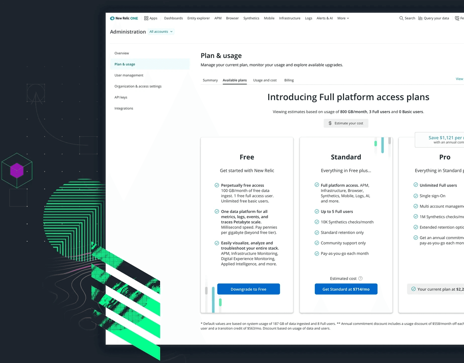

How do we increase conversions of startup customers with an annual spend below $25k?
Buyers
Approves budgets and tools; has the power to buy monitoring solutions.
Eng Managers, Finance or Procurement Managers
Developer Users
Any software engineer using monitoring software for any part of their role in the last 30 days.
Software Eng
Influencers
Indirect but noted influence over purchases, gets approval with proposals
Lead Software Engs,
Eng Managers
Early signals from customer feedback serving as starting point for investigations.
Observations
Missing, outdated product details
Poor accessibility, awkward workflows
Some SKUs are only available to purchase by contacting Sales
Most <$25k spend customers prefer to self-serve purchases
Impact
Customers exit purchases to seek answers offsite; increasing likelihood of losing a sale.
Confusing, hard to read workflows
Sales suffer from additional overhead
Startups unlikely to convert without self-serve SKUs

No starting price
The starting price isn't shown until afte the customer selects a level
Incentives lack emphasis
Annual commits were offered incentives to encourage purchase but lacked emphasis.
Hidden options
There are only two possible levels to present but both are hidden in the dropdown.
Hard to read
Level features are displayed but not very readable at this size.
Example of some notes captured in audit of prior UI. This process helped identify assumptions that could be validated through a comparative baseline testing.
Wireframes
I presented options for the redesigned experience for the browsing, viewing and adding subscriptions to cart and checkout workflows that are based on familiar workflows for purchasing products online.
Optimizations included list management functionality (pagination, filters/search, etc.) and adding descriptive, at-a-glance info to give more context for a purchase decision. A subscription calculator and toggle for monthly/annual pricing helps make it easier to predict price.
The cart view includes all items in the cart and the addition of upsell opportunities (add-ons). A simplified checkout focused on completing the purchase and the ability to edit items already in cart.
Post purchase, the user is prompted to configure their purchase or to make another buy. An abandoned cart workflow triggers if the user closes the window (abandoned cart email) or tries to navigate away from the page (internal modal).

Example wireframes based on workflow diagrams.
High fidelity
The wireframes were translated into high fidelity mocks and prepped in InVision for user testing.
Video Prototype

Detail of product card

Early signals from customer feedback serving as starting point for investigations.
Observations
Missing, outdated product details
Poor accessibility, awkward workflows
Some SKUs are only available to purchase by contacting Sales
Most <$25k spend customers prefer to self-serve purchases
Impact
Customers exit purchases to seek answers offsite; increasing likelihood of losing a sale.
Confusing, hard to read workflows
Sales suffer from additional overhead
Startups unlikely to convert without self-serve SKUs

No starting price
The starting price isn't shown until afte the customer selects a level
Incentives lack emphasis
Annual commits were offered incentives to encourage purchase but lacked emphasis.
Hidden options
There are only two possible levels to present but both are hidden in the dropdown.
Hard to read
Level features are displayed but not very readable at this size.
Example of some notes captured in audit of prior UI. This process helped identify assumptions that could be validated through a comparative baseline testing.
Wireframes
I presented options for the redesigned experience for the browsing, viewing and adding subscriptions to cart and checkout workflows that are based on familiar workflows for purchasing products online.
Optimizations included list management functionality (pagination, filters/search, etc.) and adding descriptive, at-a-glance info to give more context for a purchase decision. A subscription calculator and toggle for monthly/annual pricing helps make it easier to predict price.
The cart view includes all items in the cart and the addition of upsell opportunities (add-ons). A simplified checkout focused on completing the purchase and the ability to edit items already in cart.
Post purchase, the user is prompted to configure their purchase or to make another buy. An abandoned cart workflow triggers if the user closes the window (abandoned cart email) or tries to navigate away from the page (internal modal).

Example wireframes based on workflow diagrams.
High fidelity
The wireframes were translated into high fidelity mocks and prepped in InVision for user testing.
Video Prototype

Detail of product card

Early signals from customer feedback serving as starting point for investigations.
Observations
Missing, outdated product details
Poor accessibility, awkward workflows
Some SKUs are only available to purchase by contacting Sales
Most <$25k spend customers prefer to self-serve purchases
Impact
Customers exit purchases to seek answers offsite; increasing likelihood of losing a sale.
Confusing, hard to read workflows
Sales suffer from additional overhead
Startups unlikely to convert without self-serve SKUs

No starting price
The starting price isn't shown until afte the customer selects a level
Incentives lack emphasis
Annual commits were offered incentives to encourage purchase but lacked emphasis.
Hidden options
There are only two possible levels to present but both are hidden in the dropdown.
Hard to read
Level features are displayed but not very readable at this size.
Example of some notes captured in audit of prior UI. This process helped identify assumptions that could be validated through a comparative baseline testing.
Wireframes
I presented options for the redesigned experience for the browsing, viewing and adding subscriptions to cart and checkout workflows that are based on familiar workflows for purchasing products online.
Optimizations included list management functionality (pagination, filters/search, etc.) and adding descriptive, at-a-glance info to give more context for a purchase decision. A subscription calculator and toggle for monthly/annual pricing helps make it easier to predict price.
The cart view includes all items in the cart and the addition of upsell opportunities (add-ons). A simplified checkout focused on completing the purchase and the ability to edit items already in cart.
Post purchase, the user is prompted to configure their purchase or to make another buy. An abandoned cart workflow triggers if the user closes the window (abandoned cart email) or tries to navigate away from the page (internal modal).

Example wireframes based on workflow diagrams.
High fidelity
The wireframes were translated into high fidelity mocks and prepped in InVision for user testing.
Video Prototype

Detail of product card

Early signals from customer feedback serving as starting point for investigations.
Observations
Missing, outdated product details
Poor accessibility, awkward workflows
Some SKUs are only available to purchase by contacting Sales
Most <$25k spend customers prefer to self-serve purchases
Impact
Customers exit purchases to seek answers offsite; increasing likelihood of losing a sale.
Confusing, hard to read workflows
Sales suffer from additional overhead
Startups unlikely to convert without self-serve SKUs

No starting price
The starting price isn't shown until afte the customer selects a level
Incentives lack emphasis
Annual commits were offered incentives to encourage purchase but lacked emphasis.
Hidden options
There are only two possible levels to present but both are hidden in the dropdown.
Hard to read
Level features are displayed but not very readable at this size.
Example of some notes captured in audit of prior UI. This process helped identify assumptions that could be validated through a comparative baseline testing.
Wireframes
I presented options for the redesigned experience for the browsing, viewing and adding subscriptions to cart and checkout workflows that are based on familiar workflows for purchasing products online.
Optimizations included list management functionality (pagination, filters/search, etc.) and adding descriptive, at-a-glance info to give more context for a purchase decision. A subscription calculator and toggle for monthly/annual pricing helps make it easier to predict price.
The cart view includes all items in the cart and the addition of upsell opportunities (add-ons). A simplified checkout focused on completing the purchase and the ability to edit items already in cart.
Post purchase, the user is prompted to configure their purchase or to make another buy. An abandoned cart workflow triggers if the user closes the window (abandoned cart email) or tries to navigate away from the page (internal modal).

Example wireframes based on workflow diagrams.
High fidelity
The wireframes were translated into high fidelity mocks and prepped in InVision for user testing.
Video Prototype

Detail of product card

Early signals from customer feedback serving as starting point for investigations.
Observations
Missing, outdated product details
Poor accessibility, awkward workflows
Some product SKUs were only available to purchase by contacting Sales
Most <$25k spend customers prefer to self-serve all their purchases
Impact
Customers exit purchases to seek answers offsite; increasing likelihood of losing a sale.
Confusing, hard to read workflows
Sales suffer from additional overhead
Startups unlikely to convert without self-serve SKUs

No starting price
The starting price isn't shown until afte the customer selects a level
Incentives lack emphasis
Annual commits were offered incentives to encourage purchase but lacked emphasis.
Hidden options
There are only two possible levels to present but both are hidden in the dropdown.
Hard to read
Level features are displayed but not very readable at this size.
Example of some notes captured in audit of prior UI. This process helped identify assumptions that could be validated through a comparative baseline testing.
Wireframes
I presented options for the redesigned experience for the browsing, viewing and adding subscriptions to cart and checkout workflows that are based on familiar workflows for purchasing products online.
Optimizations included list management functionality (pagination, filters/search, etc.) and adding descriptive, at-a-glance info to give more context for a purchase decision. A subscription calculator and toggle for monthly/annual pricing helps make it easier to predict price.
The cart view includes all items in the cart and the addition of upsell opportunities (add-ons). A simplified checkout focused on completing the purchase and the ability to edit items already in cart.
Post purchase, the user is prompted to configure their purchase or to make another buy. An abandoned cart workflow triggers if the user closes the window (abandoned cart email) or tries to navigate away from the page (internal modal).

Example wireframes based on workflow diagrams.
High fidelity mocks
The wireframes were translated into high fidelity mocks and prepped in InVision for user testing.
Video Prototype

Detail of product card

Early signals from customer feedback serving as starting point for investigations.
Observations
Missing, outdated product details
Poor accessibility, awkward workflows
Some product SKUs were only available to purchase by contacting Sales
Most <$25k spend customers prefer to self-serve all their purchases
Impact
Customers exit purchases to seek answers offsite; increasing likelihood of losing a sale.
Confusing, hard to read workflows
Sales suffer from additional overhead
Startups unlikely to convert without self-serve SKUs

No starting price
The starting price isn't shown until afte the customer selects a level
Incentives lack emphasis
Annual commits were offered incentives to encourage purchase but lacked emphasis.
Hidden options
There are only two possible levels to present but both are hidden in the dropdown.
Hard to read
Level features are displayed but not very readable at this size.
Example of some notes captured in audit of prior UI. This process helped identify assumptions that could be validated through a comparative baseline testing.
Wireframes
I presented options for the redesigned experience for the browsing, viewing and adding subscriptions to cart and checkout workflows that are based on familiar workflows for purchasing products online.
Optimizations included list management functionality (pagination, filters/search, etc.) and adding descriptive, at-a-glance info to give more context for a purchase decision. A subscription calculator and toggle for monthly/annual pricing helps make it easier to predict price.
The cart view includes all items in the cart and the addition of upsell opportunities (add-ons). A simplified checkout focused on completing the purchase and the ability to edit items already in cart.
Post purchase, the user is prompted to configure their purchase or to make another buy. An abandoned cart workflow triggers if the user closes the window (abandoned cart email) or tries to navigate away from the page (internal modal).

Example wireframes based on workflow diagrams.
High fidelity mocks
The wireframes were translated into high fidelity mocks and prepped in InVision for user testing.
Video Prototype

Detail of product card

Early signals from customer feedback serving as starting point for investigations.
Observations
Missing, outdated product details
Poor accessibility, awkward workflows
Some product SKUs were only available to purchase by contacting Sales
Most <$25k spend customers prefer to self-serve all their purchases
Impact
Customers exit purchases to seek answers offsite; increasing likelihood of losing a sale.
Confusing, hard to read workflows
Sales suffer from additional overhead
Startups unlikely to convert without self-serve SKUs

No starting price
The starting price isn't shown until afte the customer selects a level
Incentives lack emphasis
Annual commits were offered incentives to encourage purchase but lacked emphasis.
Hidden options
There are only two possible levels to present but both are hidden in the dropdown.
Hard to read
Level features are displayed but not very readable at this size.
Example of some notes captured in audit of prior UI. This process helped identify assumptions that could be validated through a comparative baseline testing.
Wireframes
I presented options for the redesigned experience for the browsing, viewing and adding subscriptions to cart and checkout workflows that are based on familiar workflows for purchasing products online.
Optimizations included list management functionality (pagination, filters/search, etc.) and adding descriptive, at-a-glance info to give more context for a purchase decision. A subscription calculator and toggle for monthly/annual pricing helps make it easier to predict price.
The cart view includes all items in the cart and the addition of upsell opportunities (add-ons). A simplified checkout focused on completing the purchase and the ability to edit items already in cart.
Post purchase, the user is prompted to configure their purchase or to make another buy. An abandoned cart workflow triggers if the user closes the window (abandoned cart email) or tries to navigate away from the page (internal modal).

Example wireframes based on workflow diagrams.
High fidelity mocks
The wireframes were translated into high fidelity mocks and prepped in InVision for user testing.
Video Prototype

Detail of product card

Early signals from customer feedback serving as starting point for investigations.
Observations
Missing, outdated product details
Poor accessibility, awkward workflows
Some product SKUs were only available to purchase by contacting Sales
Most <$25k spend customers prefer to self-serve all their purchases
Impact
Customers exit purchases to seek answers offsite; increasing likelihood of losing a sale.
Confusing, hard to read workflows
Sales suffer from additional overhead
Startups unlikely to convert without self-serve SKUs

No starting price
The starting price isn't shown until afte the customer selects a level
Incentives lack emphasis
Annual commits were offered incentives to encourage purchase but lacked emphasis.
Hidden options
There are only two possible levels to present but both are hidden in the dropdown.
Hard to read
Level features are displayed but not very readable at this size.
Example of some notes captured in audit of prior UI. This process helped identify assumptions that could be validated through a comparative baseline testing.
Wireframes
I presented options for the redesigned experience for the browsing, viewing and adding subscriptions to cart and checkout workflows that are based on familiar workflows for purchasing products online.
Optimizations included list management functionality (pagination, filters/search, etc.) and adding descriptive, at-a-glance info to give more context for a purchase decision. A subscription calculator and toggle for monthly/annual pricing helps make it easier to predict price.
The cart view includes all items in the cart and the addition of upsell opportunities (add-ons). A simplified checkout focused on completing the purchase and the ability to edit items already in cart.
Post purchase, the user is prompted to configure their purchase or to make another buy. An abandoned cart workflow triggers if the user closes the window (abandoned cart email) or tries to navigate away from the page (internal modal).

Example wireframes based on workflow diagrams.
High fidelity mocks
The wireframes were translated into high fidelity mocks and prepped in InVision for user testing.
Video Prototype

Detail of product card

Early signals from customer feedback serving as starting point for investigations.
Impact
Customers exit purchases to seek answers offsite; increasing likelihood of losing a sale.
Confusing, hard to read workflows
Sales suffer from additional overhead
Startups unlikely to convert without self-serve SKUs
Observations
Missing, outdated product details
Poor accessibility, awkward workflows
Some SKUs are only available to purchase by contacting Sales
Most <$25k spend customers prefer to self-serve purchases

Example of prior UI captured in the audit. This process helped identify assumptions that could be validated through a comparative baseline testing.
High fidelity
The wireframes were translated into high fidelity mocks and prepped in InVision for user testing.
Video Prototype


Detail of product card
Wireframes
I presented options for the redesigned experience for the browsing, viewing and adding subscriptions to cart and checkout workflows that are based on familiar workflows for purchasing products online.
Optimizations included list management functionality (pagination, filters/search, etc.) and adding descriptive, at-a-glance info to give more context for a purchase decision. A subscription calculator and toggle for monthly/annual pricing helps make it easier to predict price.
The cart view includes all items in the cart and the addition of upsell opportunities (add-ons). A simplified checkout focused on completing the purchase and the ability to edit items already in cart.
Post purchase, the user is prompted to configure their purchase or to make another buy. An abandoned cart workflow triggers if the user closes the window (abandoned cart email) or tries to navigate away from the page (internal modal).
Example wireframes based on workflow diagrams.


Progress is not always a straight line

Leadership announces a new pricing model…
SKU Based Pricing
(old model)
Fixed-rate based on number of units
Only access purchased SKUs
A storefront with individual products
Free unlimited Full users
Consumption Based Pricing
(New model)
Pay-as-you-go based on system usage
Get access to entire platform
Free, Standard, Pro & Enterprise tiers
Pay for Full users; Basic users free
… and we would have to shift gears to support customers under the new model.
Comparative Baseline Study
Overall, the participants preferred the new UI to the old one, noting improvements to checkout process and browsing purchases to be most helpful. With these results, we felt confident in moving forward with the new storefront designs.
Participant Users (4)
Tasks (2)
2 existing New Relic customers
2 prospective customers
Purchase an annual subscription of APM Pro in existing user experience
Repeat purchase in the proposed new user experience
Rate difficulty from 1 to 5.
(1= difficult and 5= easy)
4.25
Proposed
2.25
Existing
Which experience do
you prefer?
100%
Proposed
0%
Existing
Successfully completed
the purchase.
100%
Proposed
75%
Existing
Early signals from customer feedback serving as starting point for investigations.
Observations
Missing, outdated product details
Poor accessibility, awkward workflows
Some product SKUs were only available to purchase by contacting Sales
Most <$25k spend customers prefer to self-serve all their purchases
Impact
Customers exit purchases to seek answers offsite; increasing likelihood of losing a sale.
Confusing, hard to read workflows
Sales suffer from additional overhead
Startups unlikely to convert without self-serve SKUs
Wireframes
I presented options for the redesigned experience for the browsing, viewing and adding subscriptions to cart and checkout workflows that are based on familiar workflows for purchasing products online.
Optimizations included list management functionality (pagination, filters/search, etc.) and adding descriptive, at-a-glance info to give more context for a purchase decision. A subscription calculator and toggle for monthly/annual pricing helps make it easier to predict price.
The cart view includes all items in the cart and the addition of upsell opportunities (add-ons). A simplified checkout focused on completing the purchase and the ability to edit items already in cart.
Post purchase, the user is prompted to configure their purchase or to make another buy. An abandoned cart workflow triggers if the user closes the window (abandoned cart email) or tries to navigate away from the page (internal modal).

Example wireframes based on workflow diagrams.
High fidelity mocks
The wireframes were translated into high fidelity mocks and prepped in InVision for user testing.
Video Prototype

Detail of product card

Early signals from customer feedback serving as starting point for investigations.
Observations
Missing, outdated product details
Poor accessibility, awkward workflows
Some product SKUs were only available to purchase by contacting Sales
Most <$25k spend customers prefer to self-serve all their purchases
Impact
Customers exit purchases to seek answers offsite; increasing likelihood of losing a sale.
Confusing, hard to read workflows
Sales suffer from additional overhead
Startups unlikely to convert without self-serve SKUs
Wireframes
I presented options for the redesigned experience for the browsing, viewing and adding subscriptions to cart and checkout workflows that are based on familiar workflows for purchasing products online.
Optimizations included list management functionality (pagination, filters/search, etc.) and adding descriptive, at-a-glance info to give more context for a purchase decision. A subscription calculator and toggle for monthly/annual pricing helps make it easier to predict price.
The cart view includes all items in the cart and the addition of upsell opportunities (add-ons). A simplified checkout focused on completing the purchase and the ability to edit items already in cart.
Post purchase, the user is prompted to configure their purchase or to make another buy. An abandoned cart workflow triggers if the user closes the window (abandoned cart email) or tries to navigate away from the page (internal modal).

Example wireframes based on workflow diagrams.
High fidelity mocks
The wireframes were translated into high fidelity mocks and prepped in InVision for user testing.
Video Prototype

Detail of product card

Early signals from customer feedback serving as starting point for investigations.
Observations
Missing, outdated product details
Poor accessibility, awkward workflows
Some product SKUs were only available to purchase by contacting Sales
Most <$25k spend customers prefer to self-serve all their purchases
Impact
Customers exit purchases to seek answers offsite; increasing likelihood of losing a sale.
Confusing, hard to read workflows
Sales suffer from additional overhead
Startups unlikely to convert without self-serve SKUs
Wireframes
I presented options for the redesigned experience for the browsing, viewing and adding subscriptions to cart and checkout workflows that are based on familiar workflows for purchasing products online.
Optimizations included list management functionality (pagination, filters/search, etc.) and adding descriptive, at-a-glance info to give more context for a purchase decision. A subscription calculator and toggle for monthly/annual pricing helps make it easier to predict price.
The cart view includes all items in the cart and the addition of upsell opportunities (add-ons). A simplified checkout focused on completing the purchase and the ability to edit items already in cart.
Post purchase, the user is prompted to configure their purchase or to make another buy. An abandoned cart workflow triggers if the user closes the window (abandoned cart email) or tries to navigate away from the page (internal modal).

Example wireframes based on workflow diagrams.
High fidelity mocks
The wireframes were translated into high fidelity mocks and prepped in InVision for user testing.
Video Prototype

Detail of product card

Early signals from customer feedback serving as starting point for investigations.
Observations
Missing, outdated product details
Poor accessibility, awkward workflows
Some product SKUs were only available to purchase by contacting Sales
Most <$25k spend customers prefer to self-serve all their purchases
Impact
Customers exit purchases to seek answers offsite; increasing likelihood of losing a sale.
Confusing, hard to read workflows
Sales suffer from additional overhead
Startups unlikely to convert without self-serve SKUs
Wireframes
I presented options for the redesigned experience for the browsing, viewing and adding subscriptions to cart and checkout workflows that are based on familiar workflows for purchasing products online.
Optimizations included list management functionality (pagination, filters/search, etc.) and adding descriptive, at-a-glance info to give more context for a purchase decision. A subscription calculator and toggle for monthly/annual pricing helps make it easier to predict price.
The cart view includes all items in the cart and the addition of upsell opportunities (add-ons). A simplified checkout focused on completing the purchase and the ability to edit items already in cart.
Post purchase, the user is prompted to configure their purchase or to make another buy. An abandoned cart workflow triggers if the user closes the window (abandoned cart email) or tries to navigate away from the page (internal modal).

Example wireframes based on workflow diagrams.
High fidelity mocks
The wireframes were translated into high fidelity mocks and prepped in InVision for user testing.
Video Prototype

Detail of product card

New wireframes
I did a few explorations of a tiered plan pricing page to replace the storefront and product detail pages. We landed on an option that included optimizations to allow for existing customers to migrate to the new model.

Vertically stacked tiered pricing layout concept that was explored but eventually went with a classic horizontal layout.

Comparative Baseline Study
Overall, the participants preferred the new UI to the old one, noting improvements to checkout process and browsing purchases to be most helpful. With these results, we felt confident in moving forward with the new storefront designs.
Participant Users (4)
Tasks (2)
2 existing New Relic customers
2 prospective customers
Purchase an annual subscription of APM Pro in existing UI
Repeat purchase in the proposed new UI
Rate difficulty from 1 to 5.
(1= difficult and 5= easy)
4.25
Proposed
2.25
Existing
Which experience do
you prefer?
100%
Proposed
0%
Existing
Successfully completed
the purchase.
100%
Proposed
75%
Existing

Progress is not always a straight line.

Leadership announces a new pricing model…
SKU Based Pricing
(old model)
Fixed-rate based on number of units
Only access purchased SKUs
A storefront with individual products
Free unlimited Full users
Consumption Based Pricing
(New model)
Pay-as-you-go based on system usage
Get access to entire platform
Free, Standard, Pro & Enterprise tiers
Pay for Full users; Basic users free
… and we would have to shift gears to support customers under the new model.
New wireframes
I did a few explorations of a tiered plan pricing page to replace the storefront and product detail pages. We landed on an option that included optimizations to allow for existing customers to migrate to the new model.

Vertically stacked tiered pricing layout concept that was explored but eventually went with a classic horizontal layout.


Progress is not always a straight line.

Leadership announces a new pricing model…
SKU Based Pricing
(old model)
Fixed-rate based on number of units
Only access purchased SKUs
A storefront with individual products
Free unlimited Full users
Consumption Based Pricing
(New model)
Pay-as-you-go based on system usage
Get access to entire platform
Free, Standard, Pro & Enterprise tiers
Pay for Full users; Basic users free
… and we would have to shift gears to support customers under the new model.
New wireframes
I did a few explorations of a tiered plan pricing page to replace the storefront and product detail pages. We landed on an option that included optimizations to allow for existing customers to migrate to the new model.

Vertically stacked tiered pricing layout concept that was explored but eventually went with a classic horizontal layout.


Progress is not always a straight line.

Leadership announces a new pricing model…
SKU Based Pricing
(old model)
Fixed-rate based on number of units
Only access purchased SKUs
A storefront with individual products
Free unlimited Full users
Consumption Based Pricing
(New model)
Pay-as-you-go based on system usage
Get access to entire platform
Free, Standard, Pro & Enterprise tiers
Pay for Full users; Basic users free
… and we would have to shift gears to support customers under the new model.
New wireframes
I did a few explorations of a tiered plan pricing page to replace the storefront and product detail pages. We landed on an option that included optimizations to allow for existing customers to migrate to the new model.

Vertically stacked tiered pricing layout concept that was explored but eventually went with a classic horizontal layout.


Progress is not always a straight line.

Leadership announces a new pricing model…
SKU Based Pricing
(old model)
Fixed-rate based on number of units
Only access purchased SKUs
A storefront with individual products
Free unlimited Full users
Consumption Based Pricing
(New model)
Pay-as-you-go based on system usage
Get access to entire platform
Free, Standard, Pro & Enterprise tiers
Pay for Full users; Basic users free
… and we would have to shift gears to support customers under the new model.
New wireframes
I did a few explorations of a tiered plan pricing page to replace the storefront and product detail pages. We landed on an option that included optimizations to allow for existing customers to migrate to the new model.

Vertically stacked tiered pricing layout concept that was explored but eventually went with a classic horizontal layout.


Progress is not always a straight line.

Leadership announces a new pricing model…
SKU Based Pricing
(old model)
Fixed-rate based on number of units
Only access purchased SKUs
A storefront with individual products
Free unlimited Full users
Consumption Based Pricing
(New model)
Pay-as-you-go based on system usage
Get access to entire platform
Free, Standard, Pro & Enterprise tiers
Pay for Full users; Basic users free
… and we would have to shift gears to support customers under the new model.
New wireframes
I did a few explorations of a tiered plan pricing page to replace the storefront and product detail pages. We landed on an option that included optimizations to allow for existing customers to migrate to the new model.

Vertically stacked tiered pricing layout concept that was explored but eventually went with a classic horizontal layout.


Progress is not always a straight line.

Leadership announces a new pricing model…
SKU Based Pricing
(old model)
Fixed-rate based on number of units
Only access purchased SKUs
A storefront with individual products
Free unlimited Full users
Consumption Based Pricing
(New model)
Pay-as-you-go based on system usage
Get access to entire platform
Free, Standard, Pro & Enterprise tiers
Pay for Full users; Basic users free
… and we would have to shift gears to support customers under the new model.
New wireframes
I did a few explorations of a tiered plan pricing page to replace the storefront and product detail pages. We landed on an option that included optimizations to allow for existing customers to migrate to the new model.

Vertically stacked tiered pricing layout concept that was explored but eventually went with a classic horizontal layout.


Progress is not always a straight line.

Leadership announces a new pricing model…
SKU Based Pricing
(old model)
Fixed-rate based on number of units
Only access purchased SKUs
A storefront with individual products
Free unlimited Full users
Consumption Based Pricing
(New model)
Pay-as-you-go based on system usage
Get access to entire platform
Free, Standard, Pro & Enterprise tiers
Pay for Full users; Basic users free
… and we would have to shift gears to support customers under the new model.
New wireframes
I did a few explorations of a tiered plan pricing page to replace the storefront and product detail pages. We landed on an option that included optimizations to allow for existing customers to migrate to the new model.

Vertically stacked tiered pricing layout concept that was explored but eventually went with a classic horizontal layout.


Progress is not always a straight line.

Leadership announces a new pricing model…
SKU Based Pricing
(old model)
Fixed-rate based on number of units
Only access purchased SKUs
A storefront with individual products
Free unlimited Full users
Consumption Based Pricing
(New model)
Pay-as-you-go based on system usage
Get access to entire platform
Free, Standard, Pro & Enterprise tiers
Pay for Full users; Basic users free
… and we would have to shift gears to support customers under the new model.
New wireframes
I did a few explorations of a tiered plan pricing page to replace the storefront and product detail pages. We landed on an option that included optimizations to allow for existing customers to migrate to the new model.

Vertically stacked tiered pricing layout concept that was explored but eventually went with a classic horizontal layout.

New Relic Plans and Pricing
A redesigned subscription experience that allows customers to scale their services at the pace of their organizational growth.
Early signals from customer feedback serving as starting point for investigations.
Observations
Missing, outdated product details
Poor accessibility, awkward workflows
Some product SKUs were only available to purchase by contacting Sales
Most <$25k spend customers prefer to self-serve all their purchases
Impact
Customers exit purchases to seek answers offsite; increasing likelihood of losing a sale.
Confusing, hard to read workflows
Sales suffer from additional overhead
Startups unlikely to convert without self-serve SKUs
Wireframes
I presented options for the redesigned experience for the browsing, viewing and adding subscriptions to cart and checkout workflows that are based on familiar workflows for purchasing products online.
Optimizations included list management functionality (pagination, filters/search, etc.) and adding descriptive, at-a-glance info to give more context for a purchase decision. A subscription calculator and toggle for monthly/annual pricing helps make it easier to predict price.
The cart view includes all items in the cart and the addition of upsell opportunities (add-ons). A simplified checkout focused on completing the purchase and the ability to edit items already in cart.
Post purchase, the user is prompted to configure their purchase or to make another buy. An abandoned cart workflow triggers if the user closes the window (abandoned cart email) or tries to navigate away from the page (internal modal).

Example wireframes based on workflow diagrams.
High fidelity mocks
The wireframes were translated into high fidelity mocks and prepped in InVision for user testing.
Video Prototype

Detail of product card

Early signals from customer feedback serving as starting point for investigations.
Observations
Missing, outdated product details
Poor accessibility, awkward workflows
Some product SKUs were only available to purchase by contacting Sales
Most <$25k spend customers prefer to self-serve all their purchases
Impact
Customers exit purchases to seek answers offsite; increasing likelihood of losing a sale.
Confusing, hard to read workflows
Sales suffer from additional overhead
Startups unlikely to convert without self-serve SKUs
Wireframes
I presented options for the redesigned experience for the browsing, viewing and adding subscriptions to cart and checkout workflows that are based on familiar workflows for purchasing products online.
Optimizations included list management functionality (pagination, filters/search, etc.) and adding descriptive, at-a-glance info to give more context for a purchase decision. A subscription calculator and toggle for monthly/annual pricing helps make it easier to predict price.
The cart view includes all items in the cart and the addition of upsell opportunities (add-ons). A simplified checkout focused on completing the purchase and the ability to edit items already in cart.
Post purchase, the user is prompted to configure their purchase or to make another buy. An abandoned cart workflow triggers if the user closes the window (abandoned cart email) or tries to navigate away from the page (internal modal).

Example wireframes based on workflow diagrams.
High fidelity mocks
The wireframes were translated into high fidelity mocks and prepped in InVision for user testing.
Video Prototype

Detail of product card

Early signals from customer feedback serving as starting point for investigations.
Observations
Missing, outdated product details
Poor accessibility, awkward workflows
Some product SKUs were only available to purchase by contacting Sales
Most <$25k spend customers prefer to self-serve all their purchases
Impact
Customers exit purchases to seek answers offsite; increasing likelihood of losing a sale.
Confusing, hard to read workflows
Sales suffer from additional overhead
Startups unlikely to convert without self-serve SKUs
Wireframes
I presented options for the redesigned experience for the browsing, viewing and adding subscriptions to cart and checkout workflows that are based on familiar workflows for purchasing products online.
Optimizations included list management functionality (pagination, filters/search, etc.) and adding descriptive, at-a-glance info to give more context for a purchase decision. A subscription calculator and toggle for monthly/annual pricing helps make it easier to predict price.
The cart view includes all items in the cart and the addition of upsell opportunities (add-ons). A simplified checkout focused on completing the purchase and the ability to edit items already in cart.
Post purchase, the user is prompted to configure their purchase or to make another buy. An abandoned cart workflow triggers if the user closes the window (abandoned cart email) or tries to navigate away from the page (internal modal).

Example wireframes based on workflow diagrams.
High fidelity mocks
The wireframes were translated into high fidelity mocks and prepped in InVision for user testing.
Video Prototype

Detail of product card

Early signals from customer feedback serving as starting point for investigations.
Observations
Missing, outdated product details
Poor accessibility, awkward workflows
Some product SKUs were only available to purchase by contacting Sales
Most <$25k spend customers prefer to self-serve all their purchases
Impact
Customers exit purchases to seek answers offsite; increasing likelihood of losing a sale.
Confusing, hard to read workflows
Sales suffer from additional overhead
Startups unlikely to convert without self-serve SKUs
Wireframes
I presented options for the redesigned experience for the browsing, viewing and adding subscriptions to cart and checkout workflows that are based on familiar workflows for purchasing products online.
Optimizations included list management functionality (pagination, filters/search, etc.) and adding descriptive, at-a-glance info to give more context for a purchase decision. A subscription calculator and toggle for monthly/annual pricing helps make it easier to predict price.
The cart view includes all items in the cart and the addition of upsell opportunities (add-ons). A simplified checkout focused on completing the purchase and the ability to edit items already in cart.
Post purchase, the user is prompted to configure their purchase or to make another buy. An abandoned cart workflow triggers if the user closes the window (abandoned cart email) or tries to navigate away from the page (internal modal).

Example wireframes based on workflow diagrams.
High fidelity mocks
The wireframes were translated into high fidelity mocks and prepped in InVision for user testing.
Video Prototype

Detail of product card

Prototype demo
Explore more projects
New Relic Plans and Pricing
A redesigned subscription experience that allows customers to scale their services at the pace of their organizational growth.

